Tarot Card & Design Elements
Font: Love
Main Color: 924C84, C0C031
![]()
![]()
![]()
![]()
![]()
![]()
![]()
![]()
![]()
![]()
![]()
![]()
![]()
![]()
![]()
![]()
![]()
![]()
![]()
![]()
![]()
![]()
![]()
Font: Love
Main Color: 924C84, C0C031


About
Love Manifesto is a school project that I designed in Spring 2022.
First, I need to write a manifesto, then design it based on the manifesto. The final deliverables can be in any form.
My manifesto is about love; I thought about what people do when they fall in love or have a favorite. People like to take psychological tests.
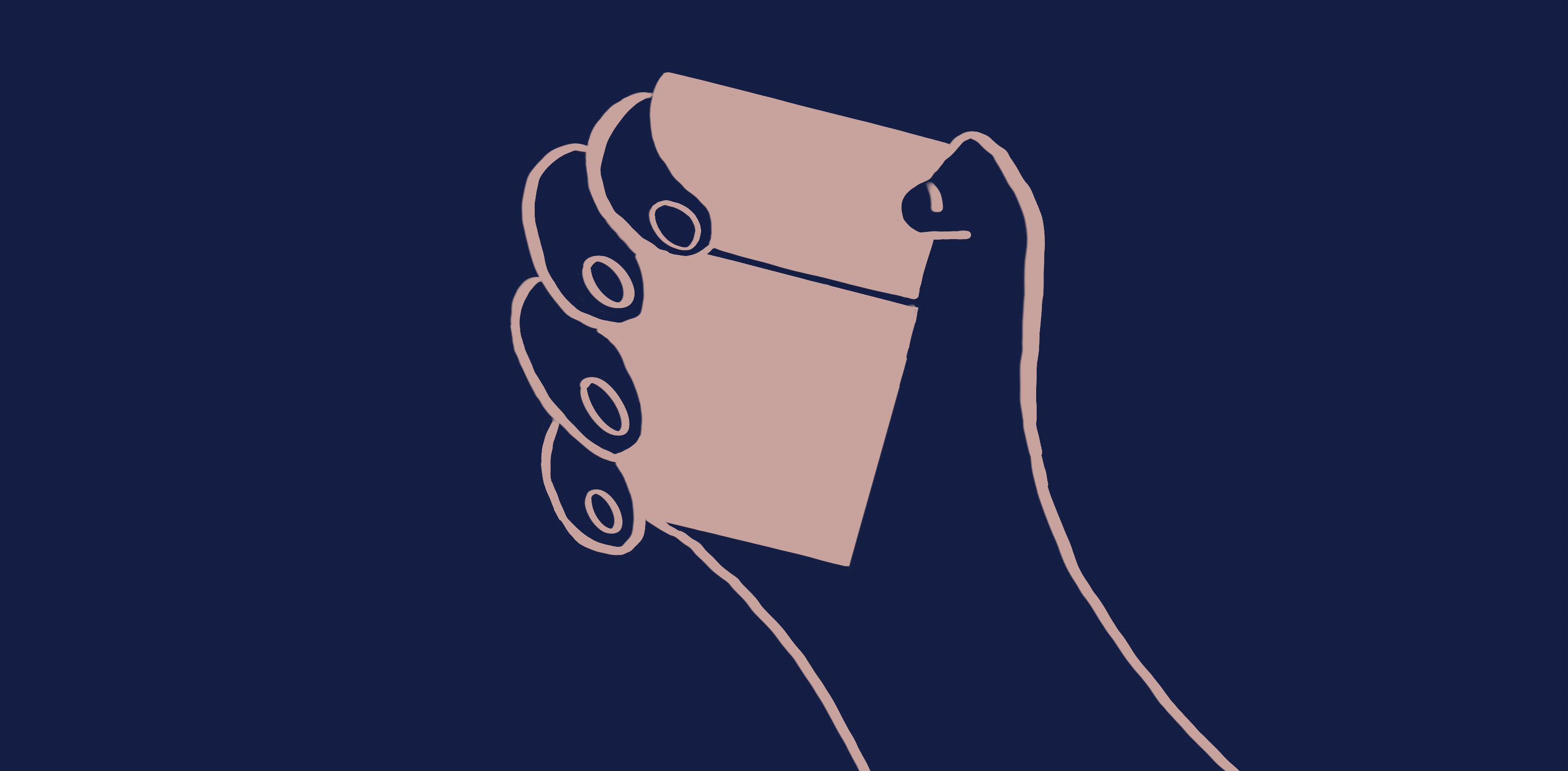
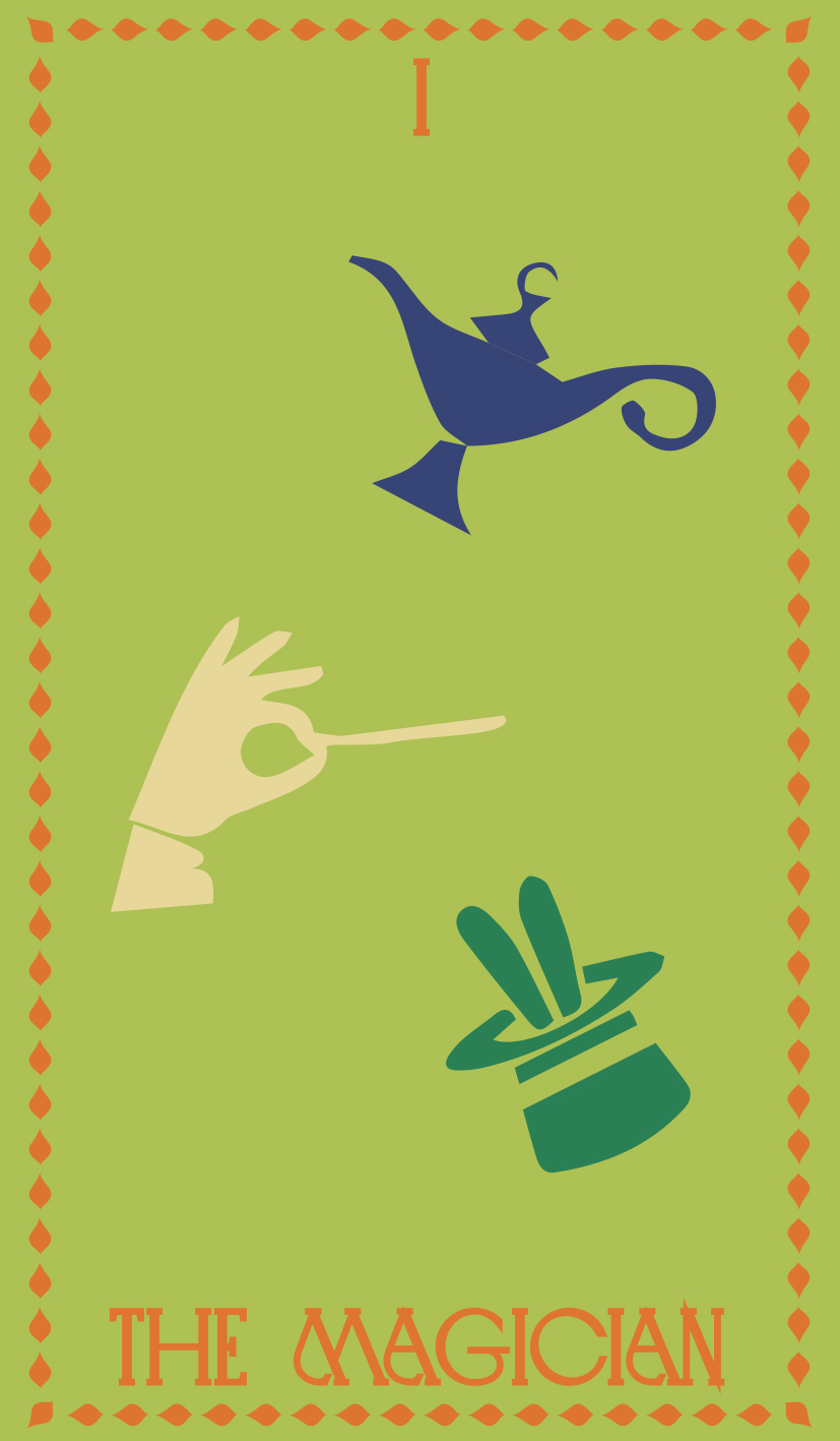
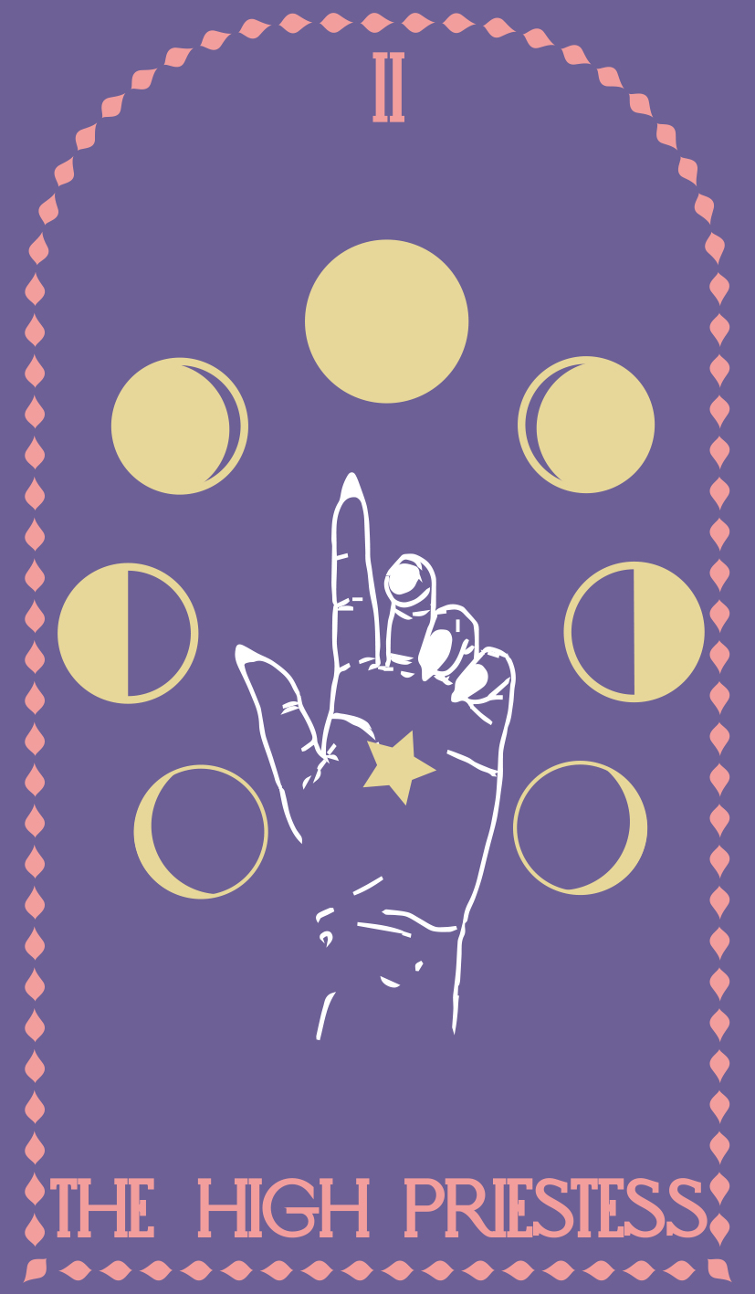
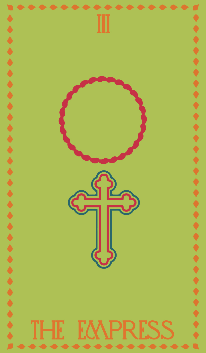
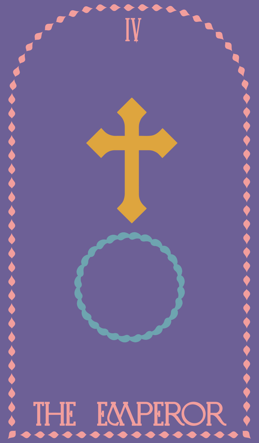
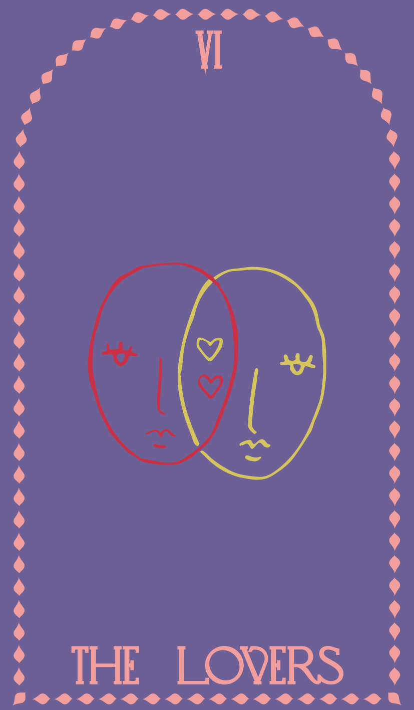
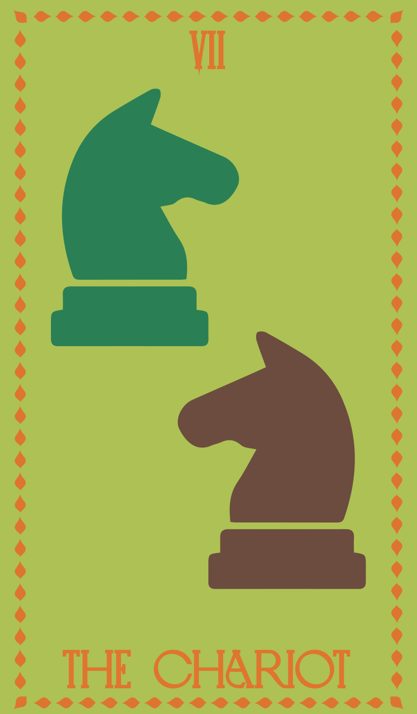
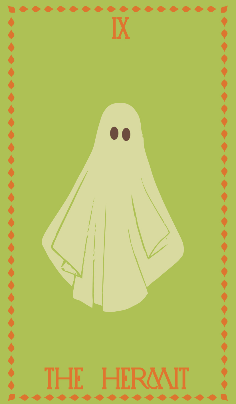
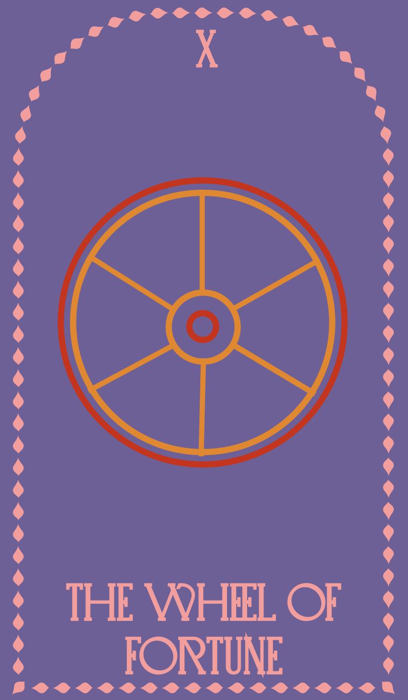
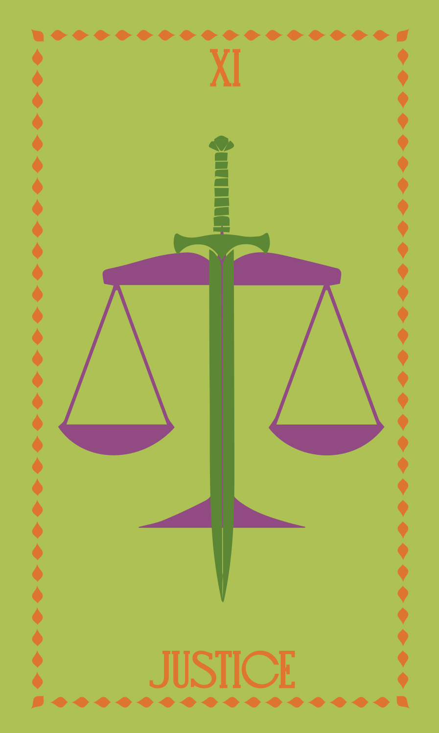
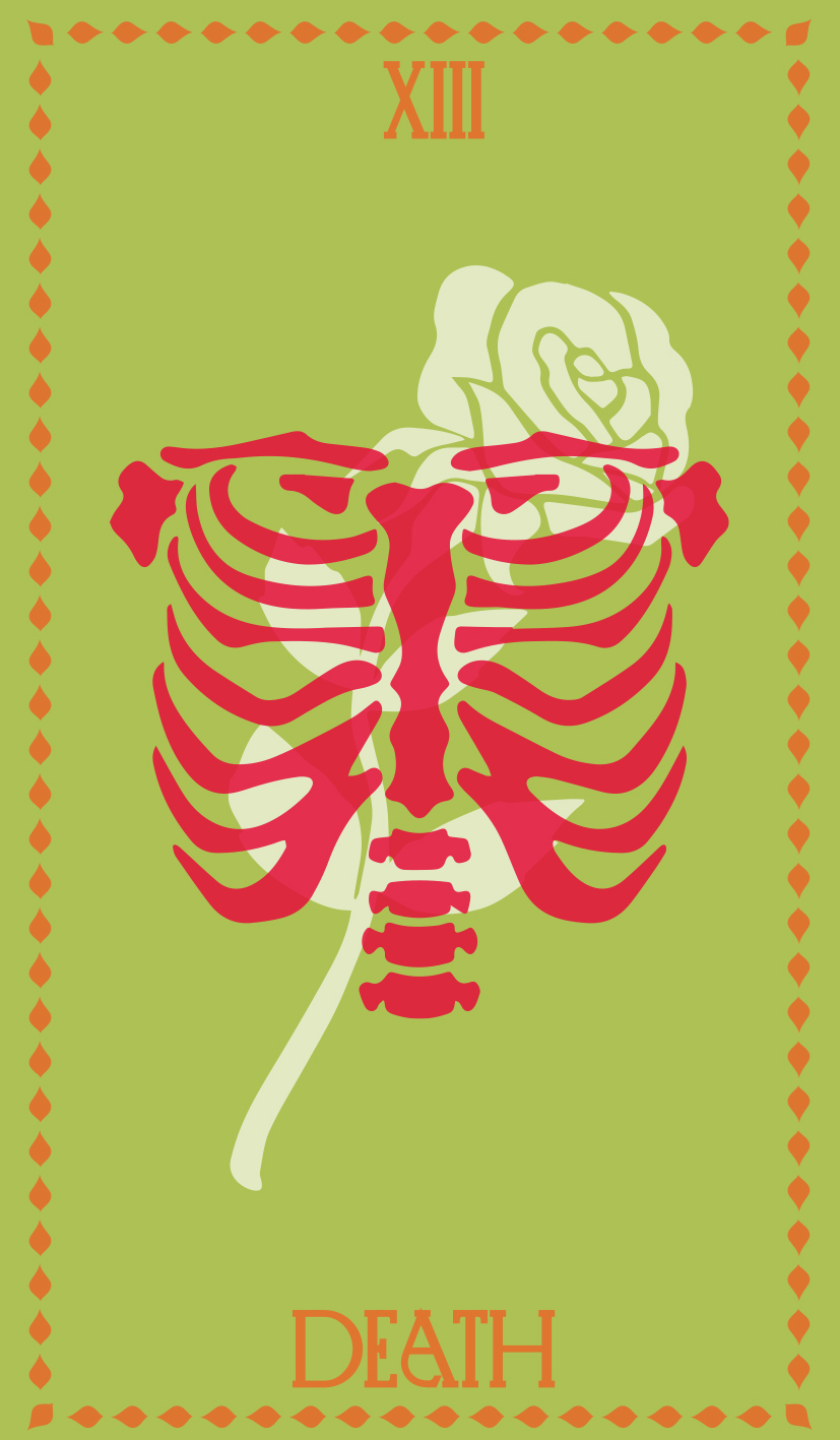
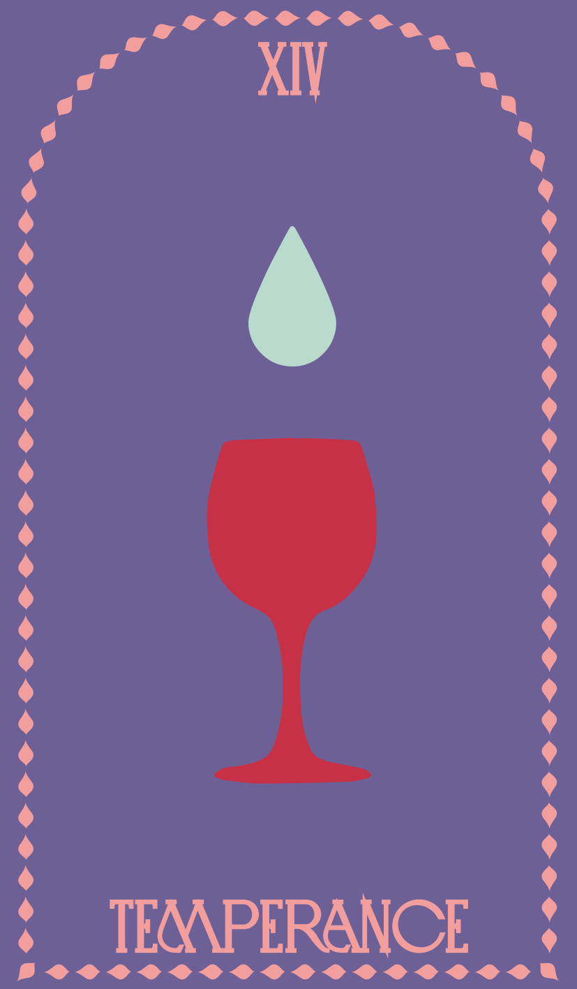
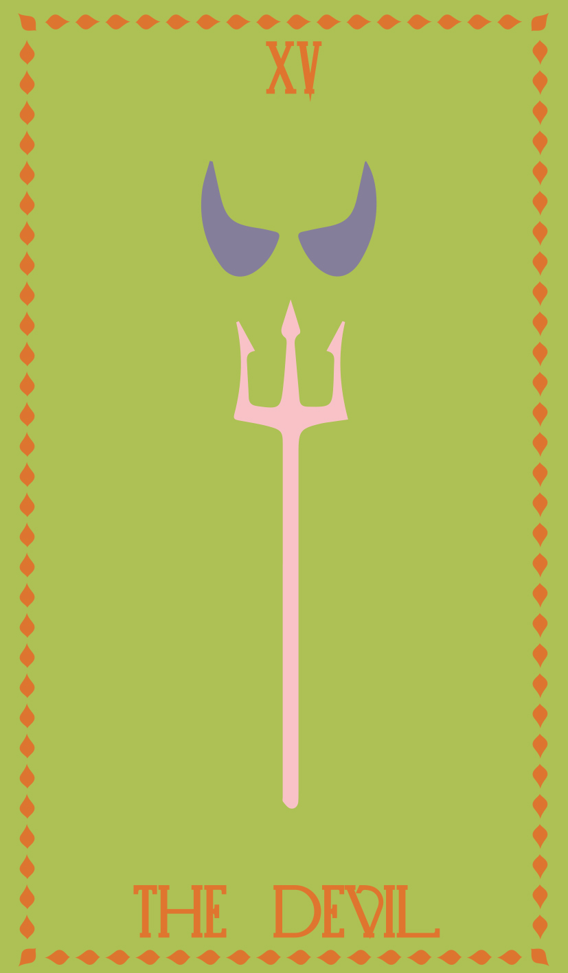
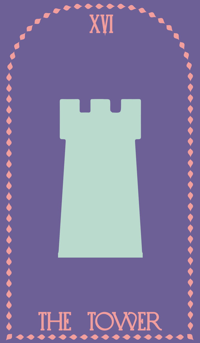
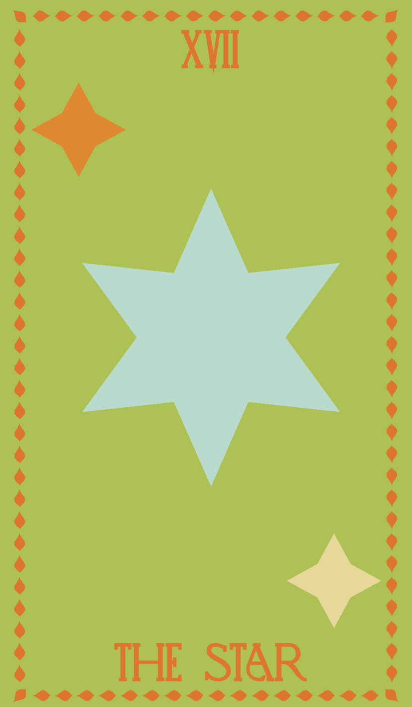
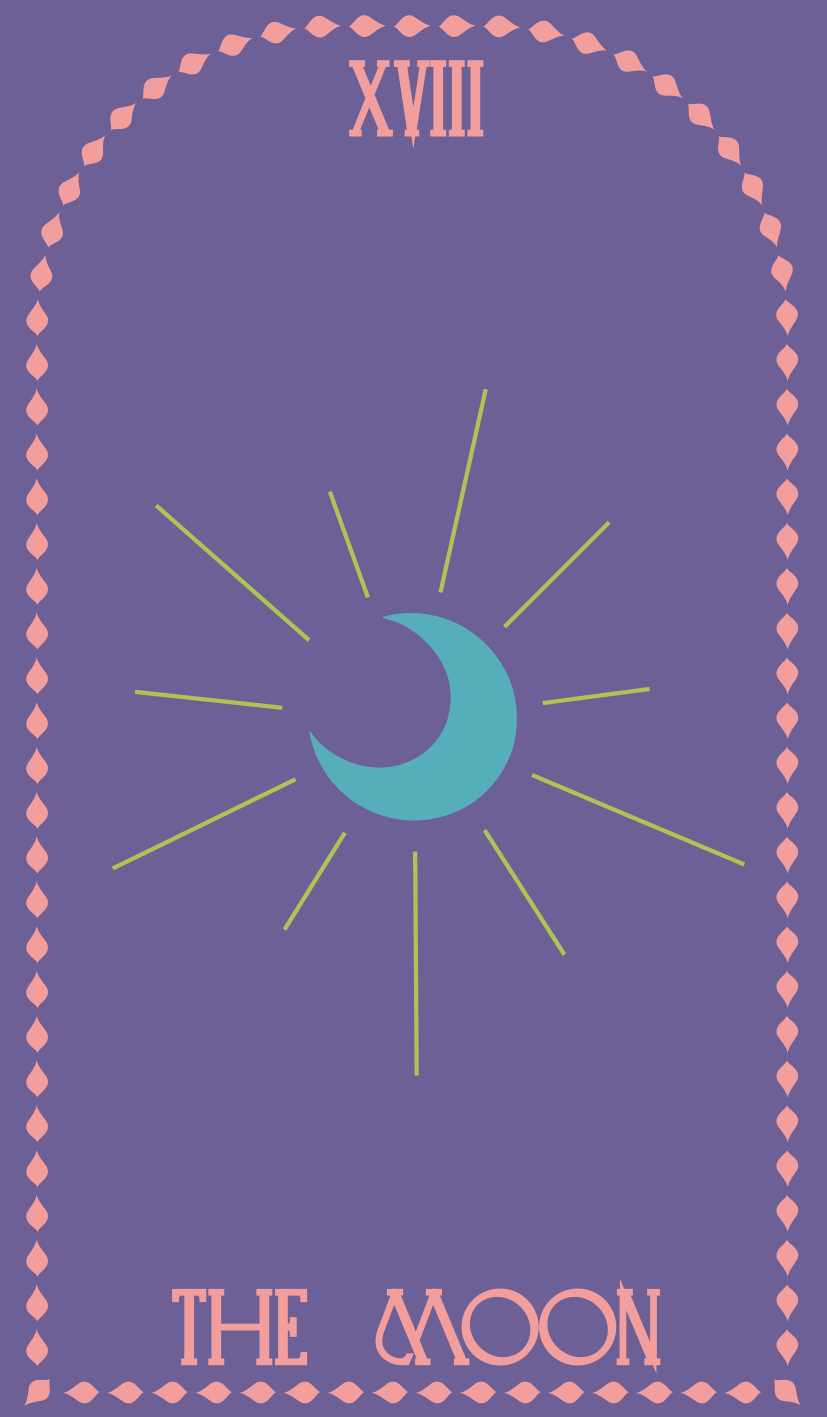
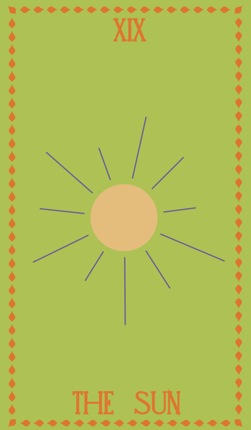
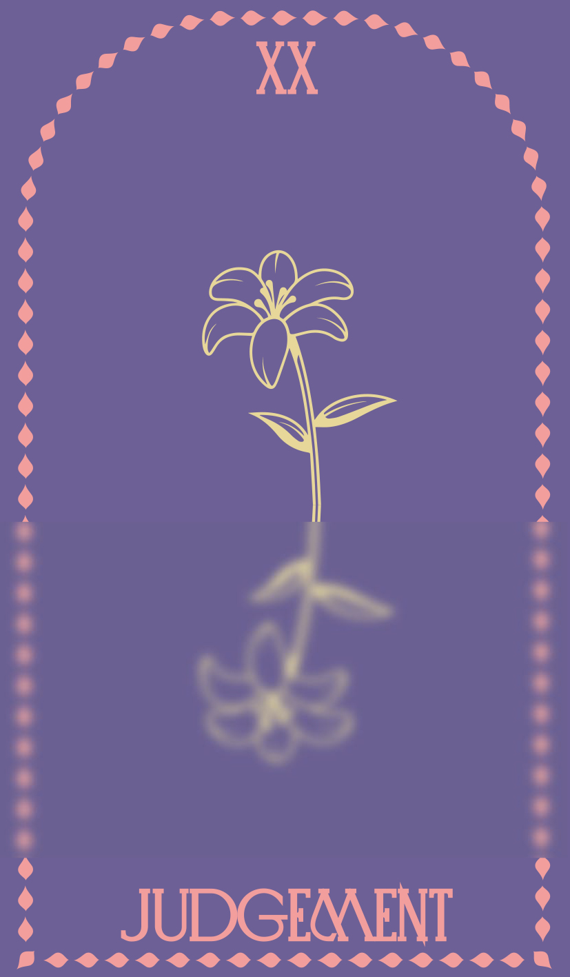
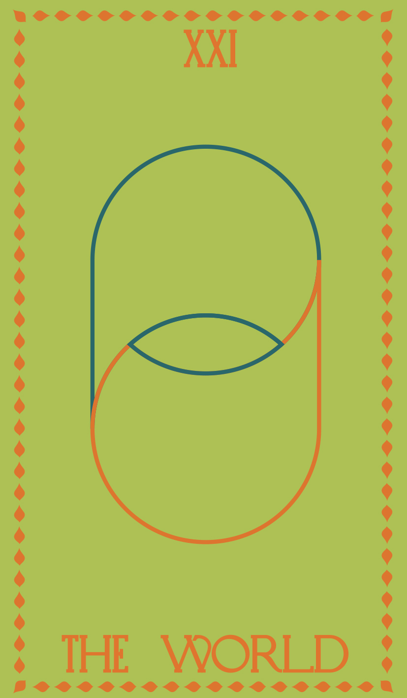
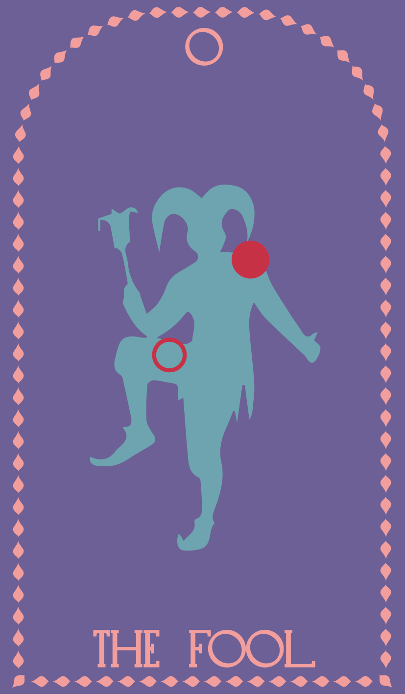
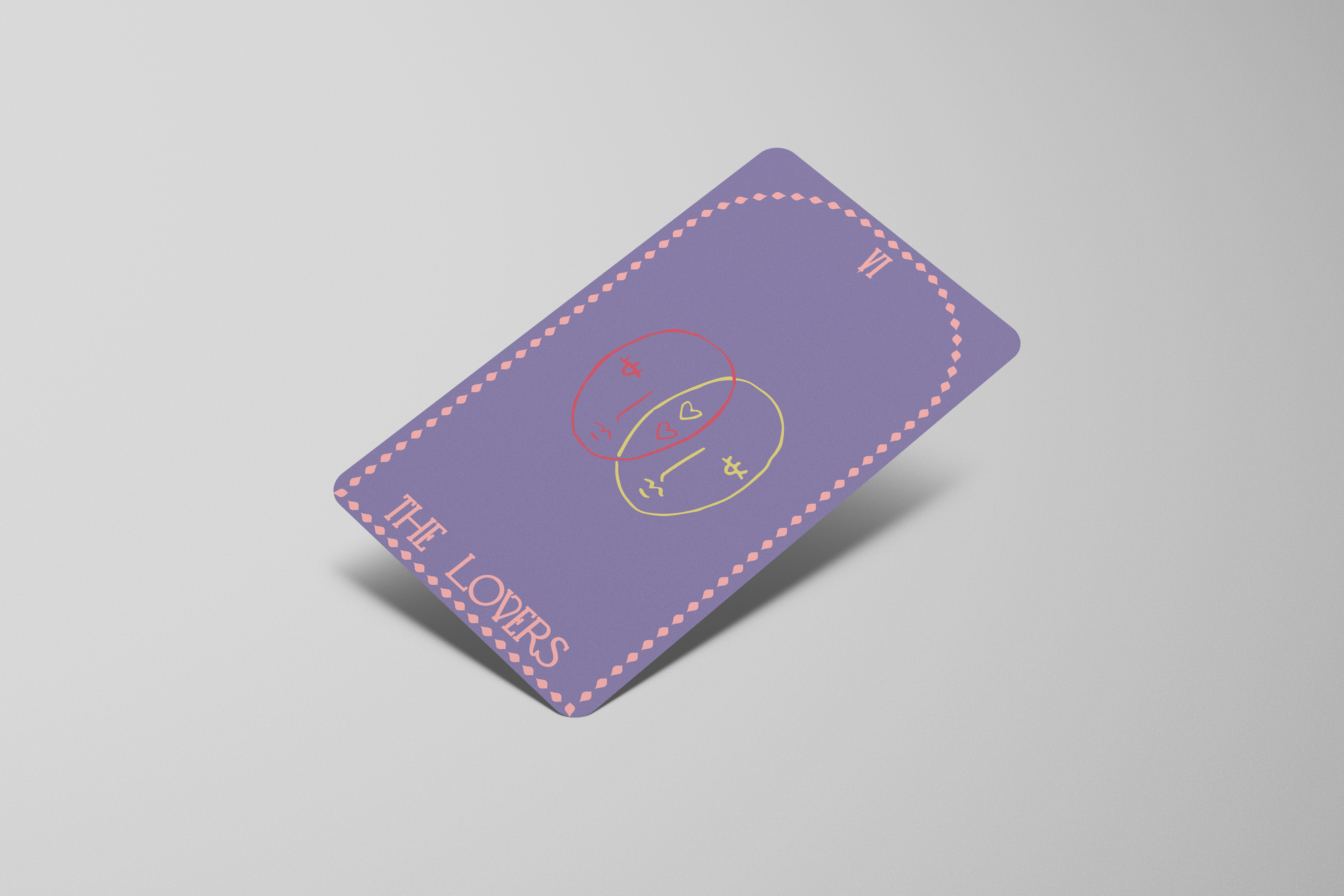
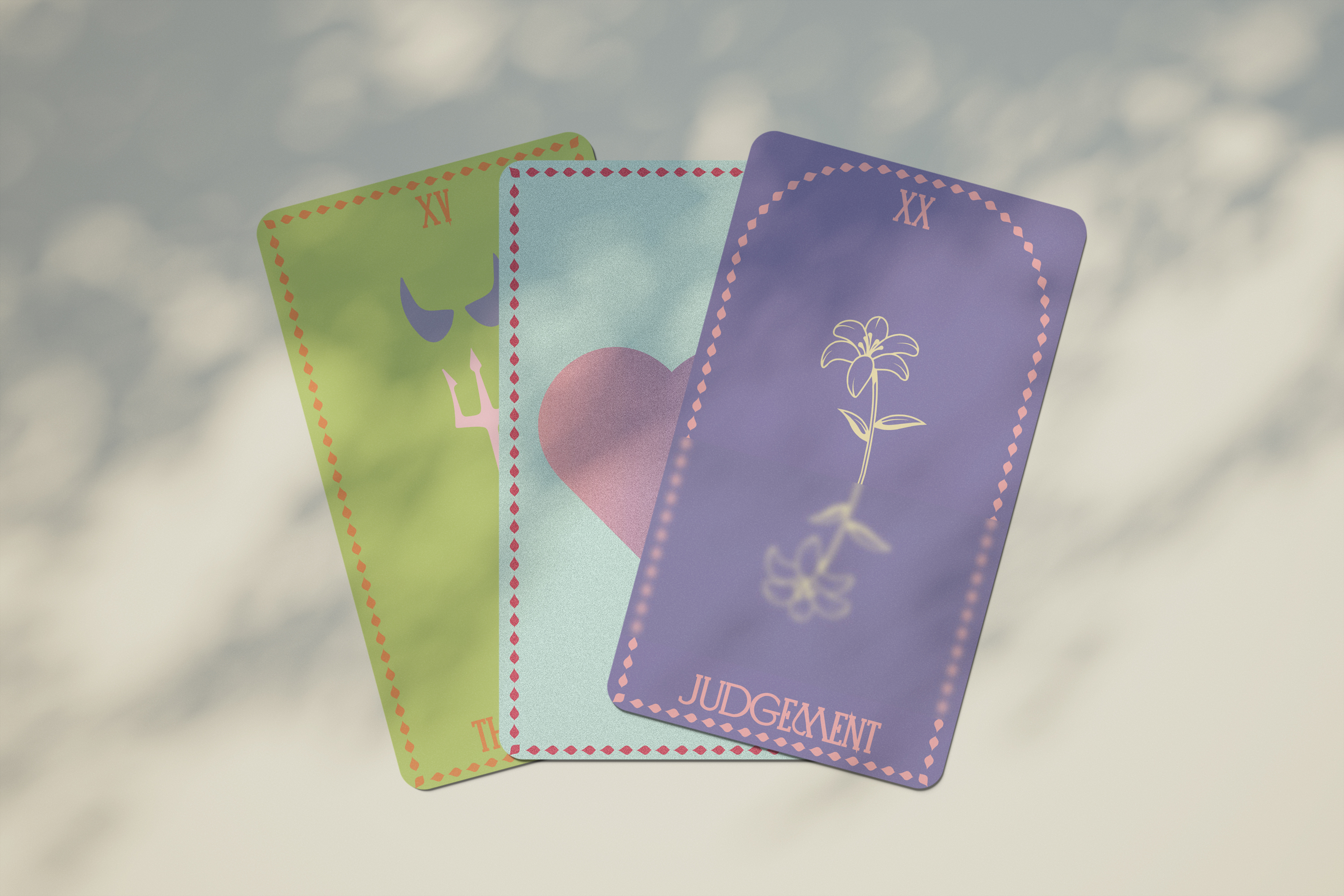
Tarot cards are a typical tool that people use. So I designed my version of tarot cards and printed them out.
(I only created 22 Grand Arcana cards.)
Love Manifesto is a school project that I designed in Spring 2022.
First, I need to write a manifesto, then design it based on the manifesto. The final deliverables can be in any form.
My manifesto is about love; I thought about what people do when they fall in love or have a favorite. People like to take psychological tests.
Tarot cards are a typical tool that people use. So I designed my version of tarot cards and printed them out.
(I only created 22 Grand Arcana cards.)
Chapter (1)
~ Love Manifesto
When we talk about love,
Love is a never-ending wave,
Love is the wave and the reef colliding with each other,
Love is a raindrop on the roses,
Love is a map that I have read a thousand times,
Love is a flowing concert,
Love is an unpublished romantic novel,
Love is a heart made of glass,
Love is the apple in the Garden of Eden,
Love is a glance between you and me,
Love is a tangible electric wave,
Love is a present tense, a past tense, and a future tense,
Love is the thing you fear to give.
Tarot Card Mock-up

Design elements & Mockup
![]()
![]()
![]()
![]()
![]()
About
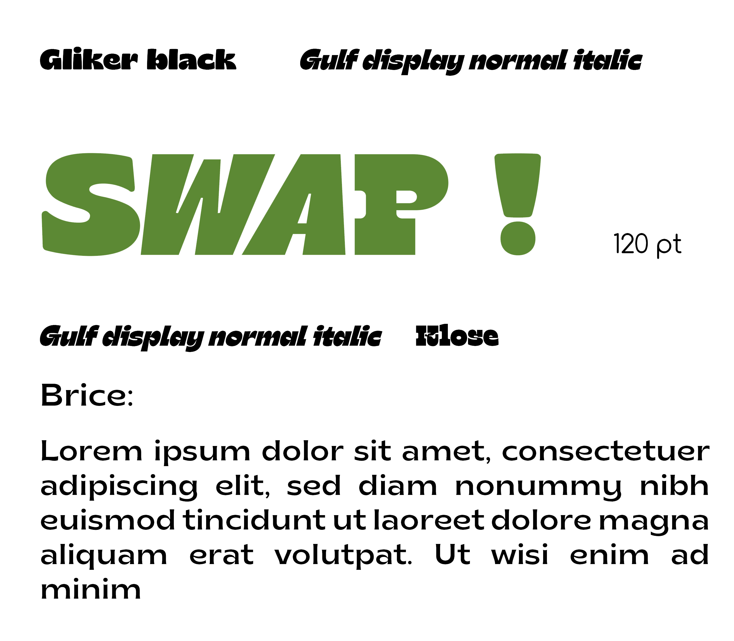
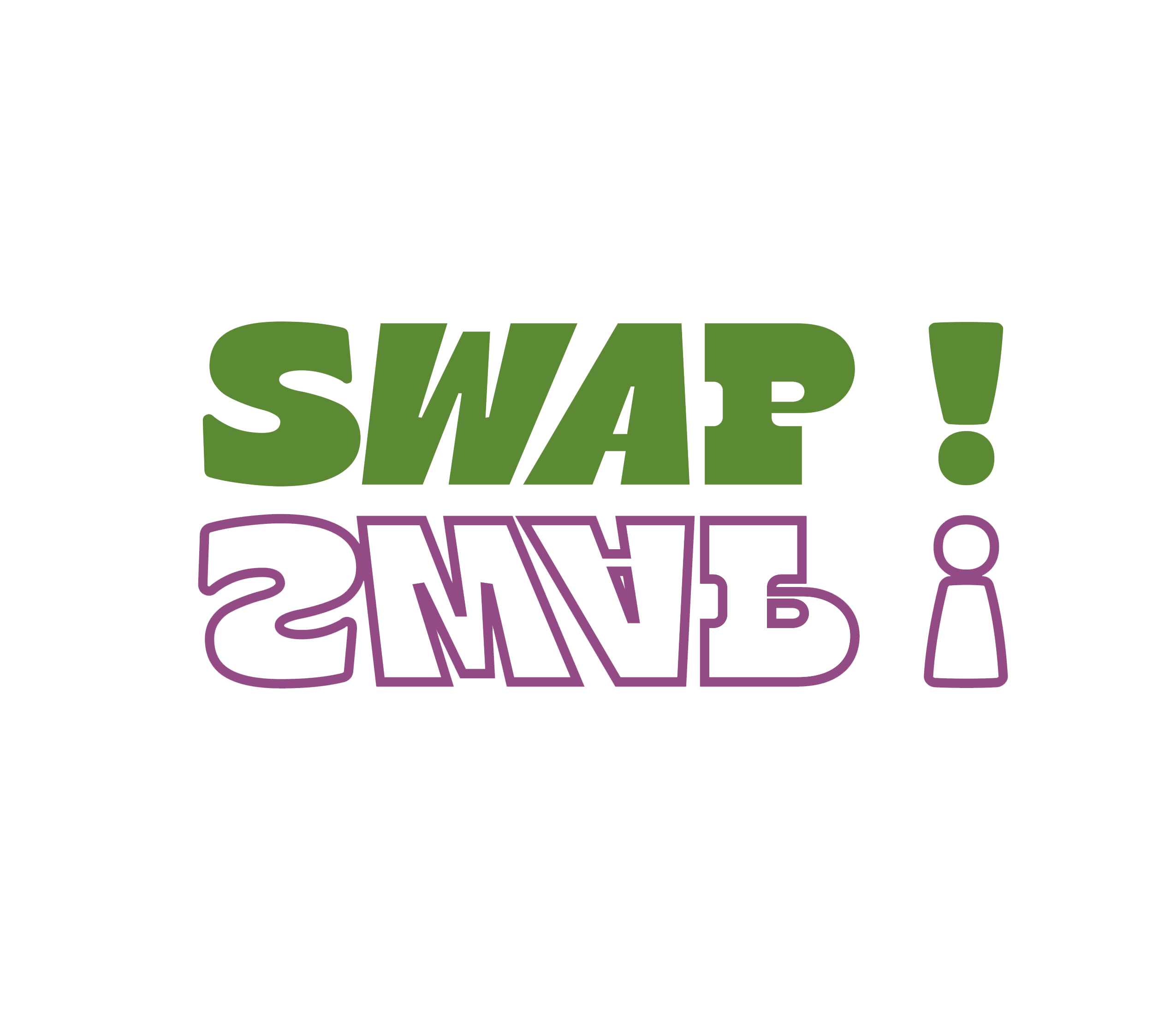
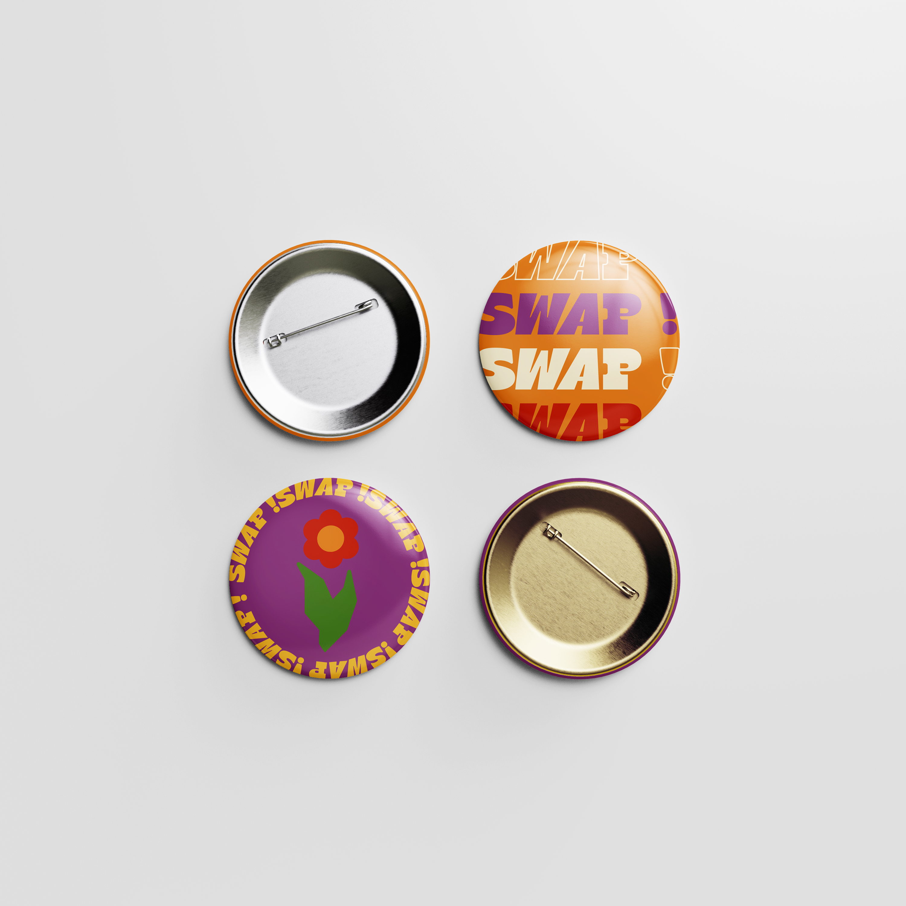
Swap Swap is also a school project that I designed in Spring 2022.
For this project, I picked a favorite theme and designed a related activity. I designed an activity to exchange items.
After deciding on the topic, I picked the color and font, and considered what feeling I wanted to deliver.
Swap Swap is also a school project that I designed in Spring 2022.
For this project, I picked a favorite theme and designed a related activity. I designed an activity to exchange items.
After deciding on the topic, I picked the color and font, and considered what feeling I wanted to deliver.
Chapter (2)
~ Swap Swap
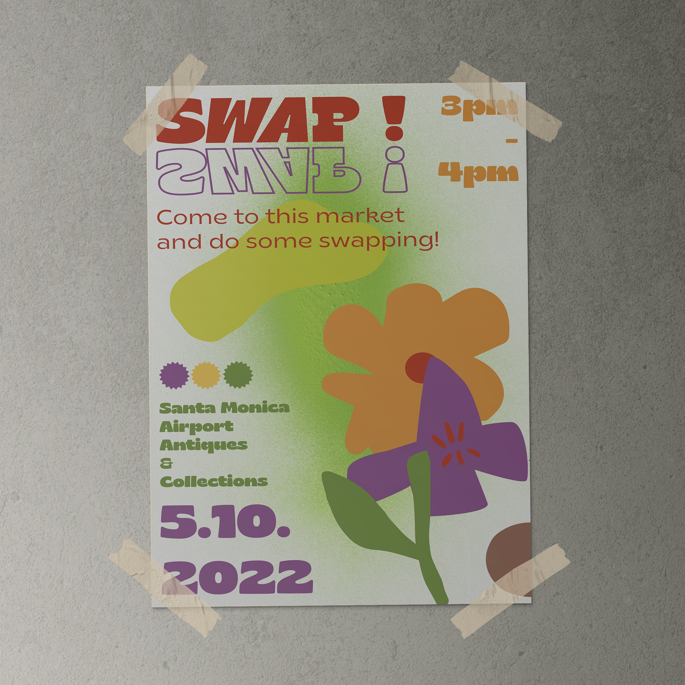
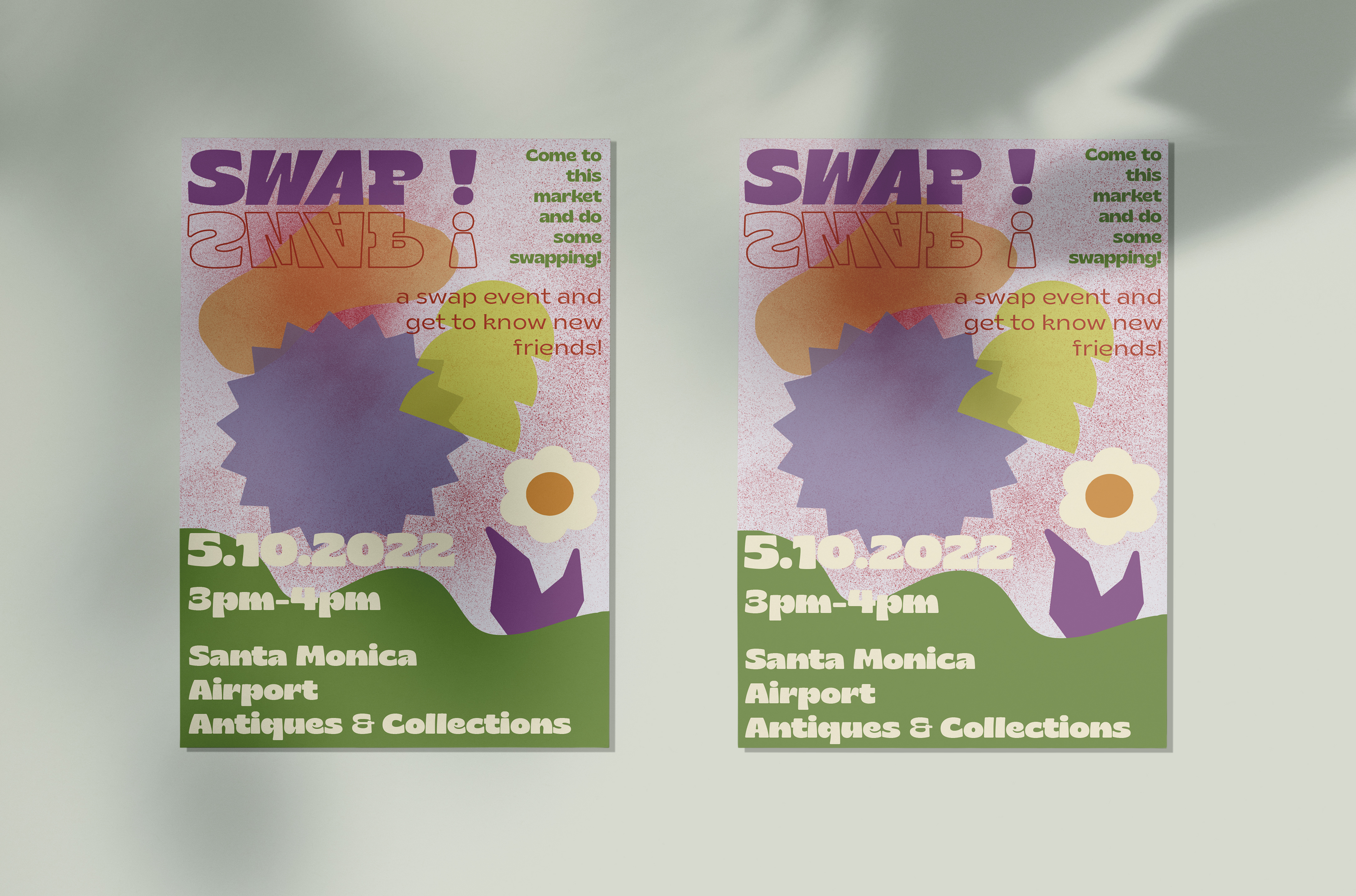
Event Name: Swap Swap
Date: 5.10.2022
Time: 3 pm-4 pm
Location: Santa Monica Airport Antiques&Collections
Terms & Conditions
Free Events and No Age Limit!!!
Participants can bring items they like, or they can make purchases on site. Swap an item with someone within an hour. Countless swaps can be made within an hour, and after the hour is up, take a group photo and express your thoughts on the event. We will select three meaningful speeches and send the surrounding gifts of the event.
Button, Ins Promote Page&Poster

Postcard&Tickets

Mural Design
![]() Pattern Design
Pattern Design
![]()
![]()
![]()
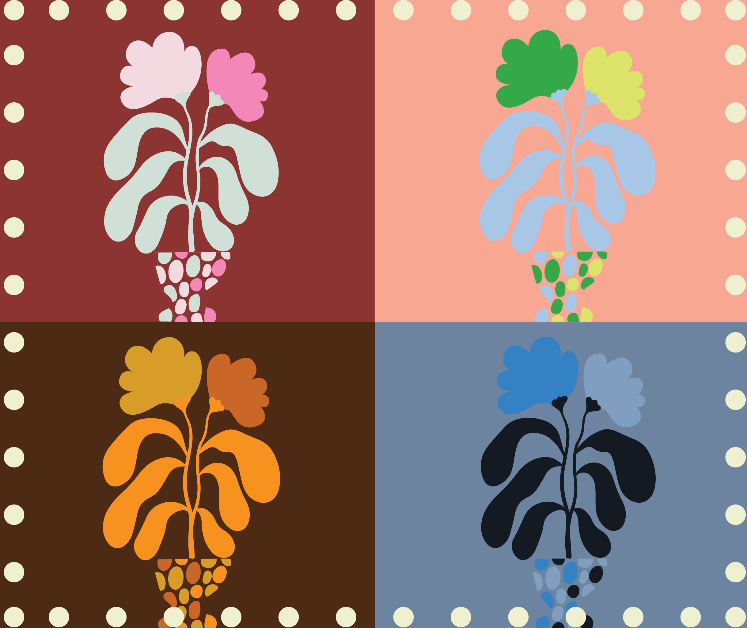 Pattern Design
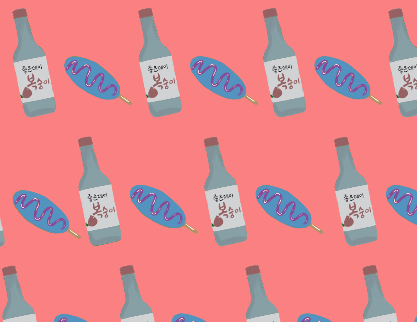
About
Surface design, Fall 2022.
Surface design, Fall 2022.
Chapter (3)
~ Surface Design
Surface Design is a class that I took in college. In this class, I designed several works that fit on different surfaces.
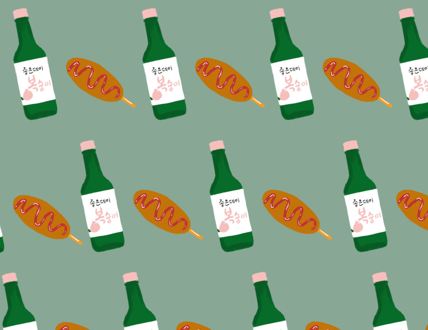
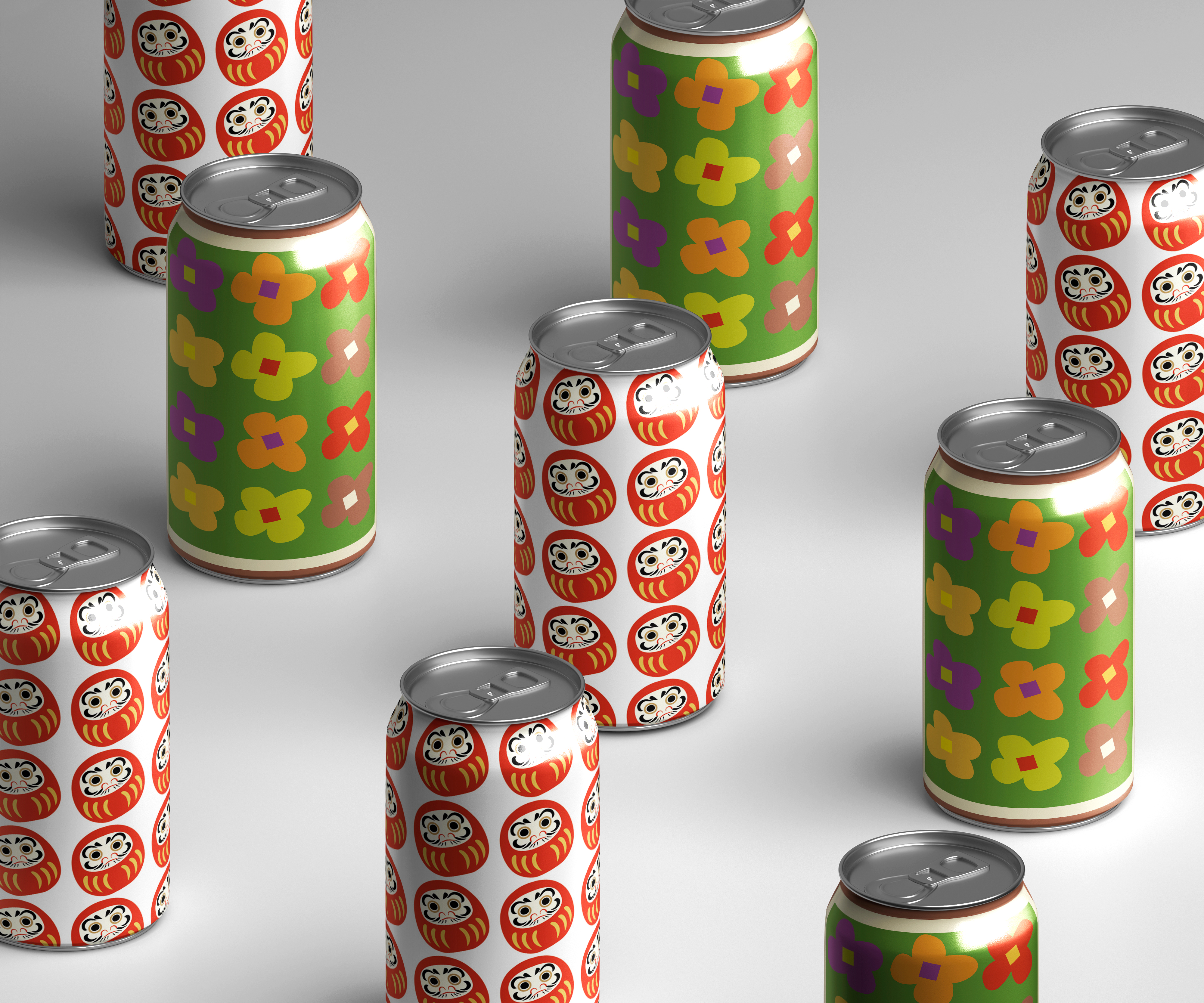
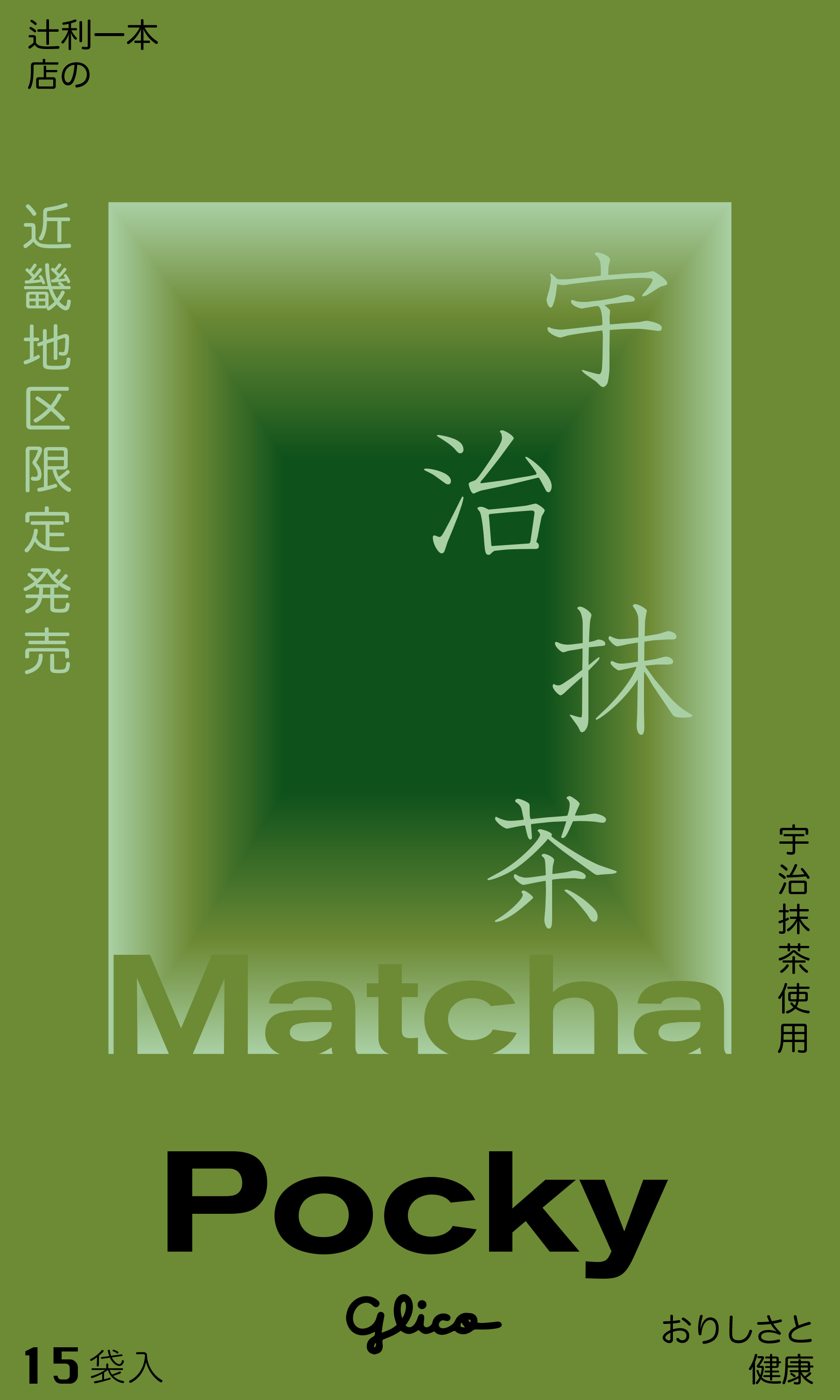
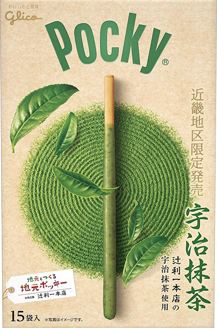
For the rebrand design, I chose my favorite snack. Pocky!
I designed 2 different versions for the package.
original/ 1st version/ 2nd version

Design Elements&Mockup
Logo, Typeface, Color
![]()
![]()
![]()
![]()
![]() Booklet
Booklet
![]()
![]()
![]()
![]()
![]()
![]()
Logo, Typeface, Color


About
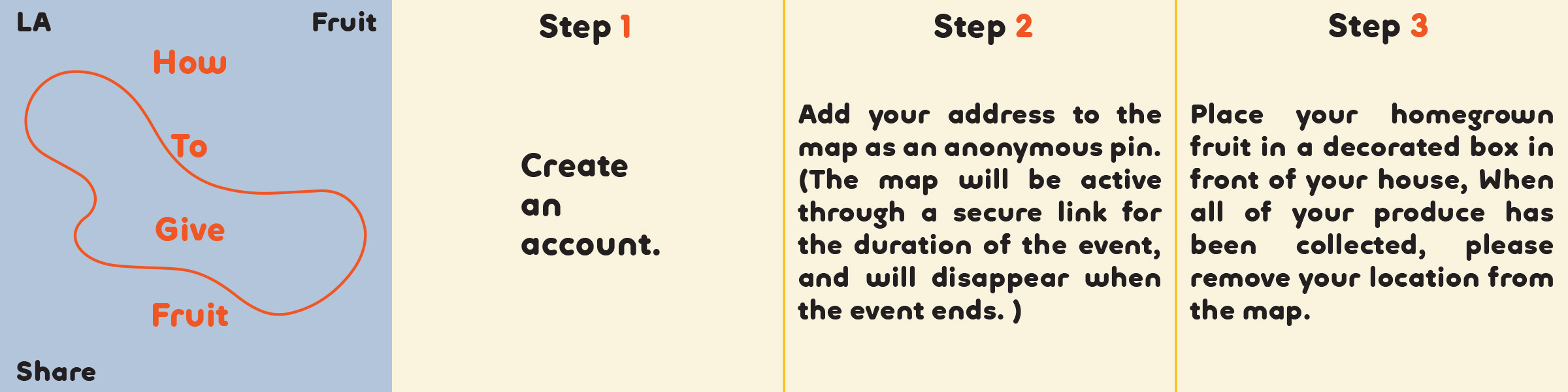
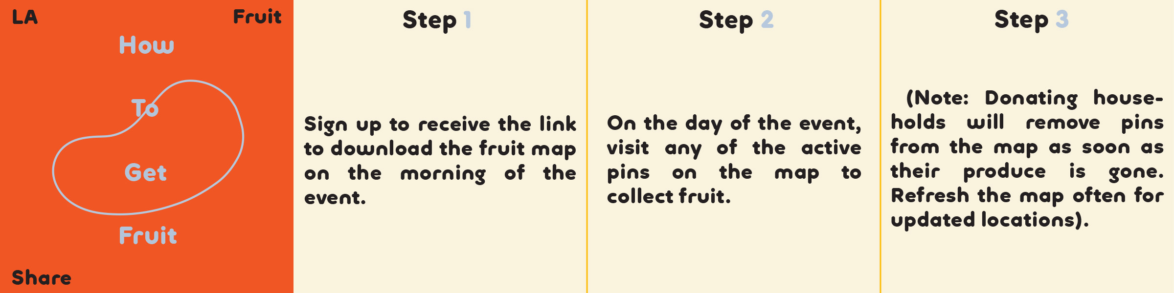
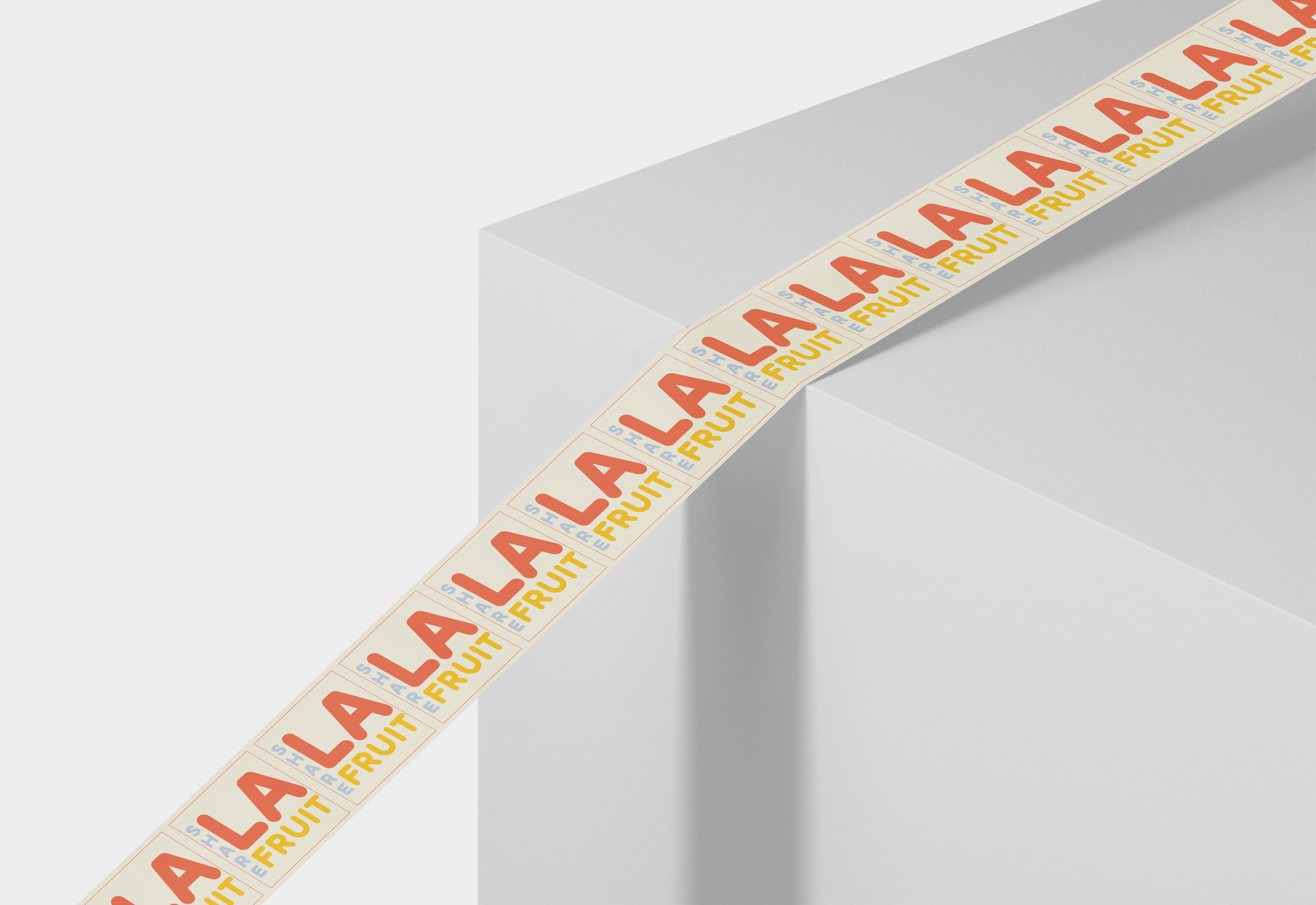
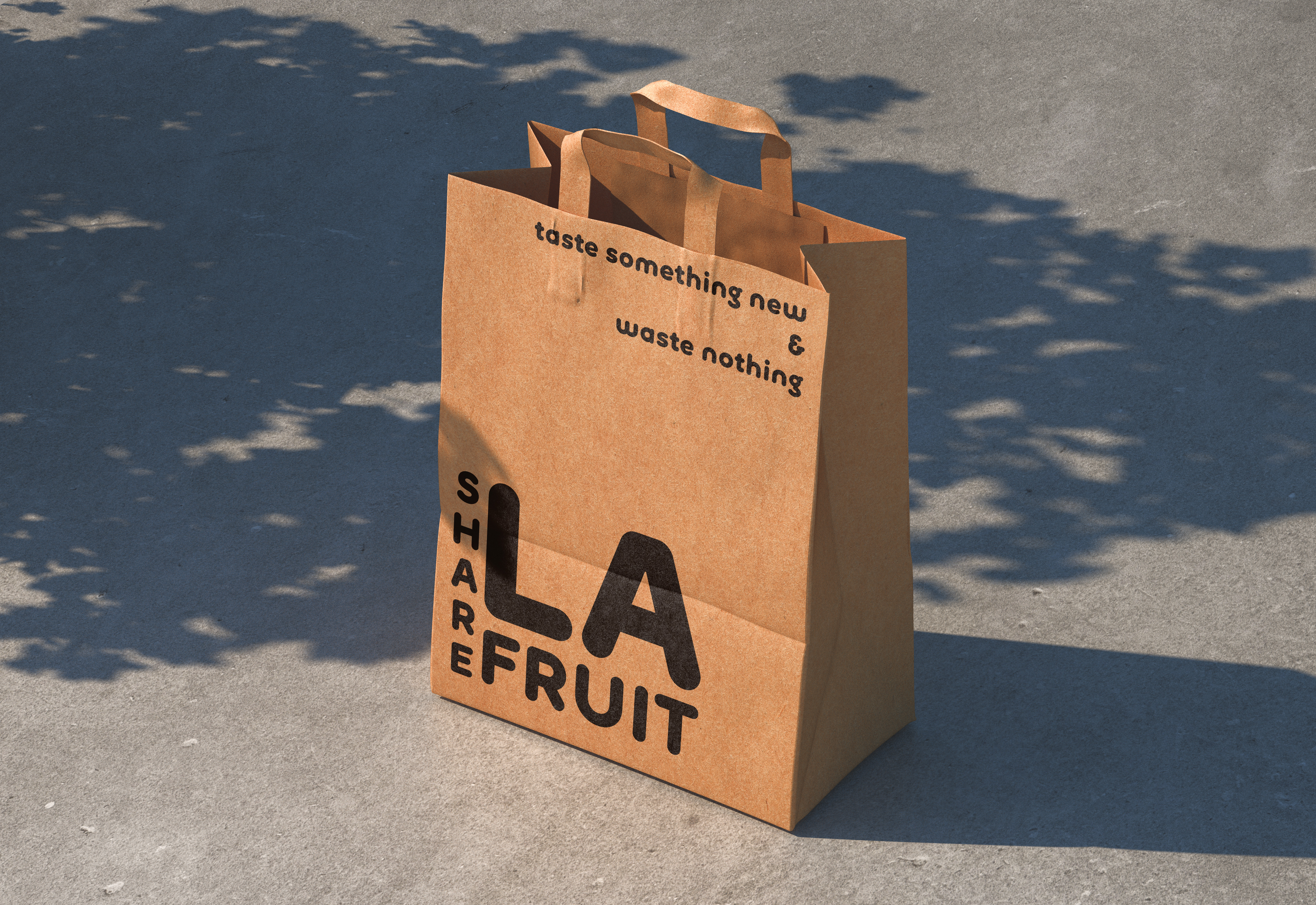
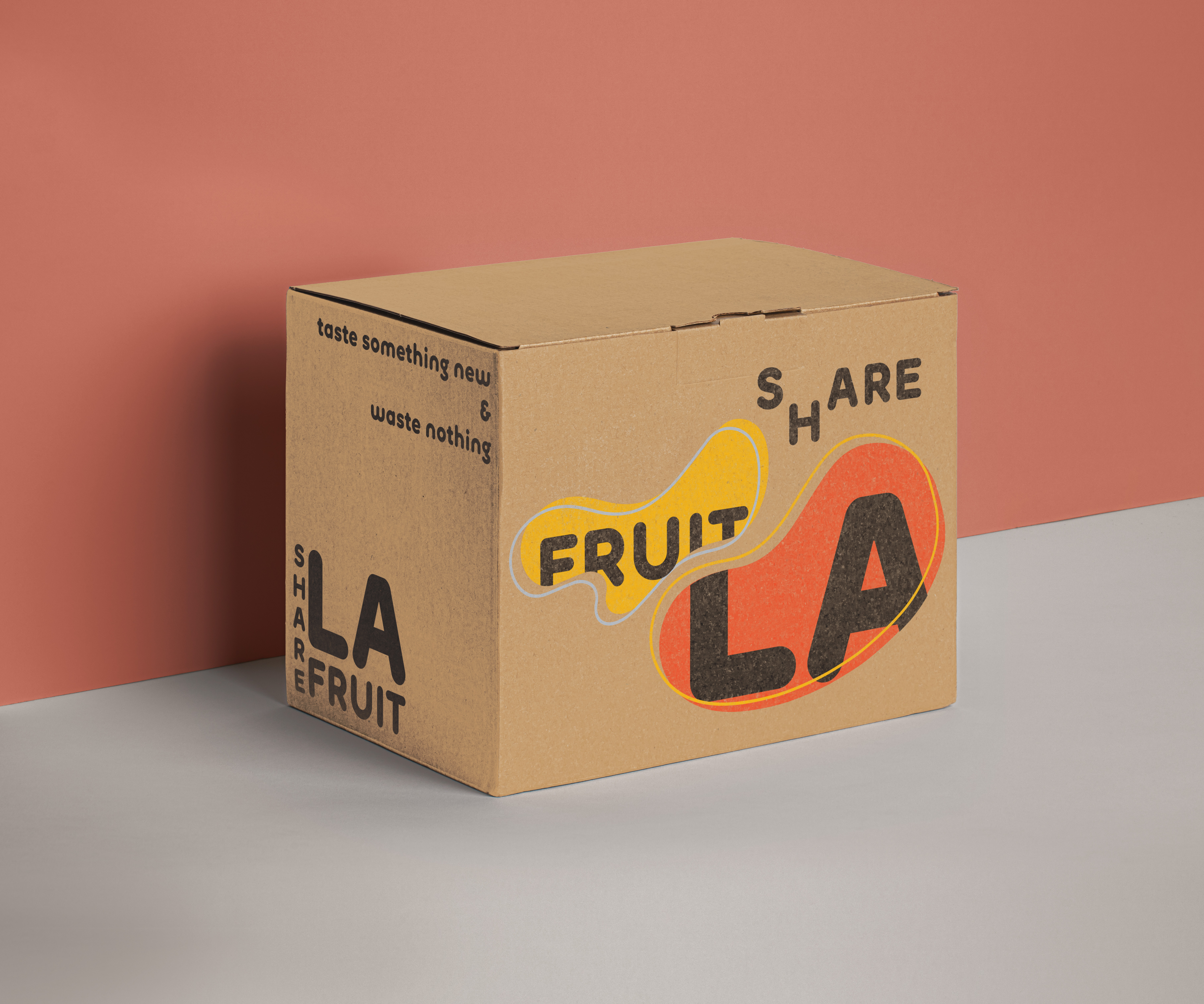
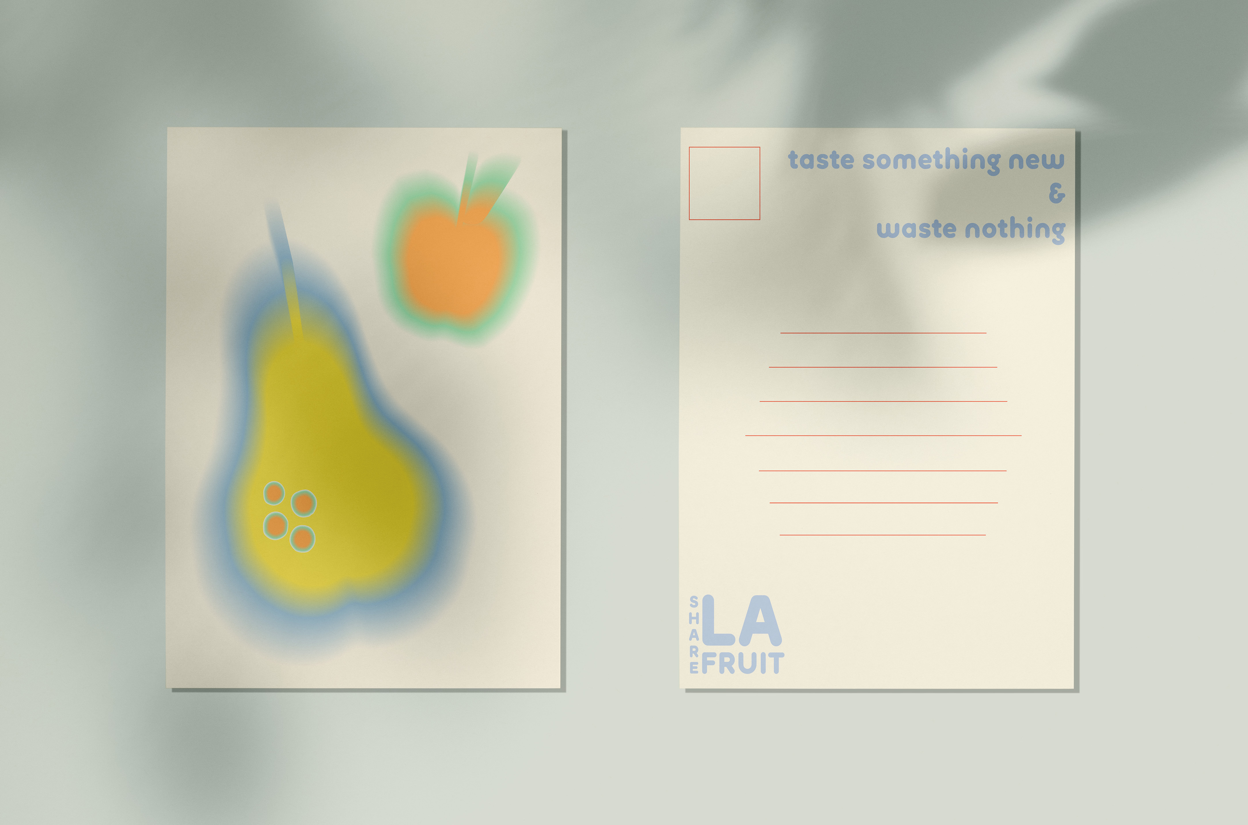
LA Fruit Share is a school project that I designed in Fall 2022.
For this project, I designed a style guide to help the nonprofit organization LA Fruit Share reestablish its identity system.
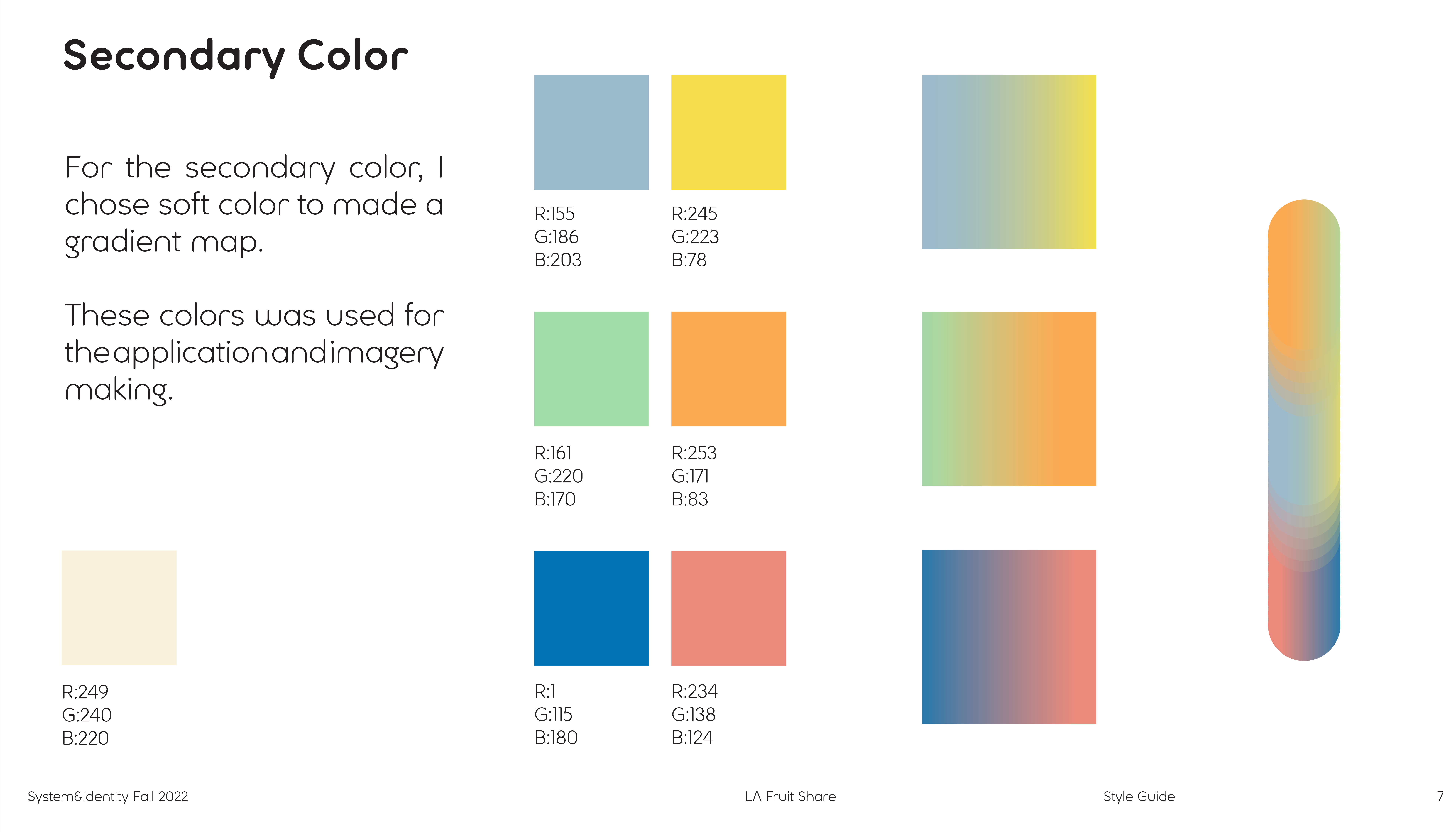
After choosing the keywords, I picked the color, font, and really thought about what feeling I wanted to deliver.
Keywords: Soft, Friendly, Energetic.
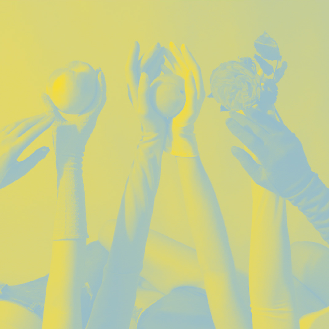
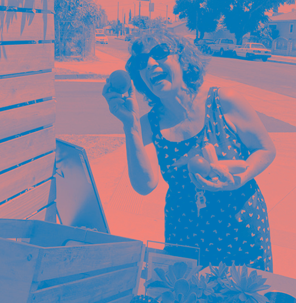
(Image Treatment)
![]()
![]()
LA Fruit Share is a school project that I designed in Fall 2022.
For this project, I designed a style guide to help the nonprofit organization LA Fruit Share reestablish its identity system.
After choosing the keywords, I picked the color, font, and really thought about what feeling I wanted to deliver.
Keywords: Soft, Friendly, Energetic.
(Image Treatment)
Chapter (4)
~ LA Fruit Share
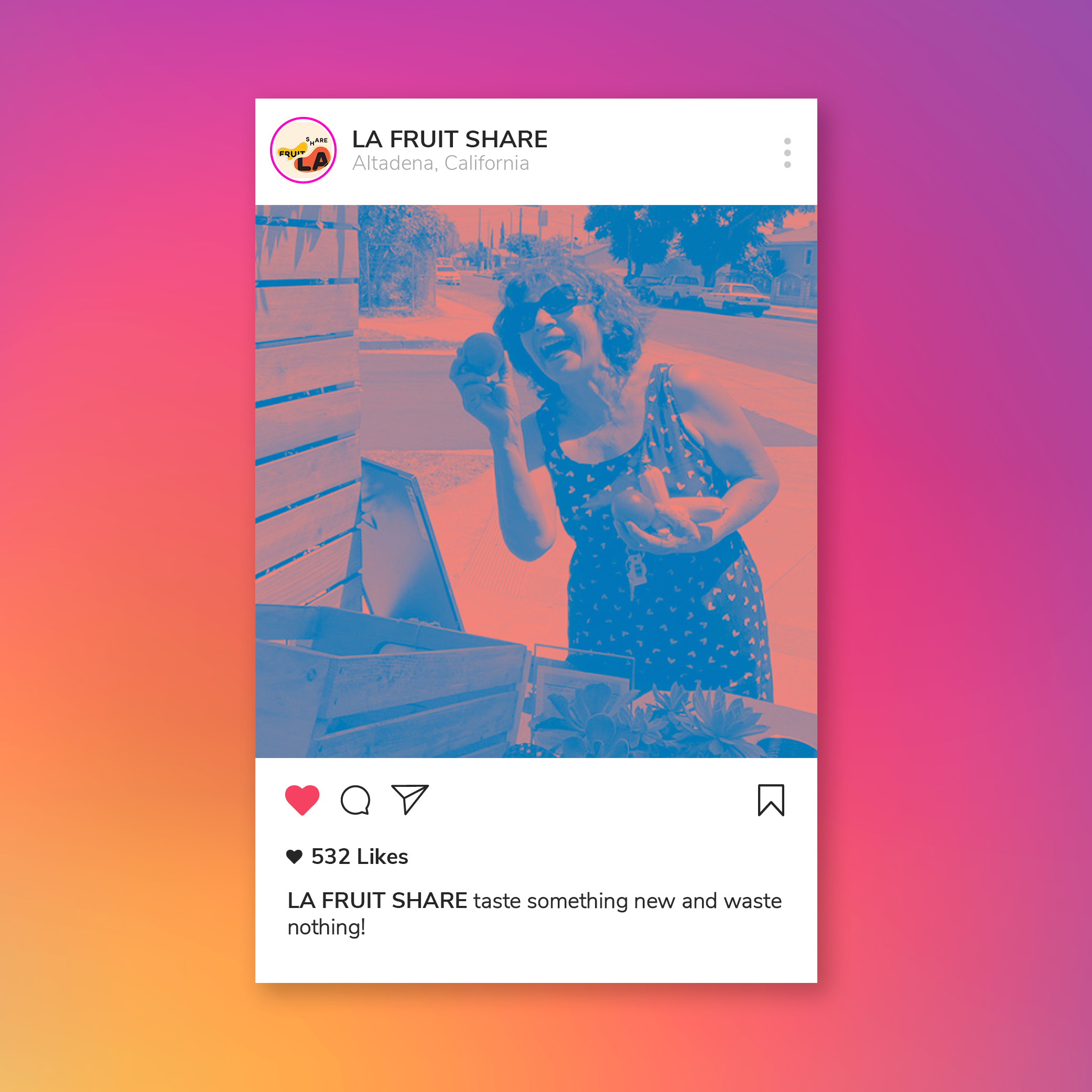
The LA Fruit Share is a seasonal call to share backyard food that all too frequently goes to waste throughout the city. Locals in Los Angeles gather their own fruits and share them with the citizens. Open to everyone, you can register and download an interactive map to collect everything.
Manifesto/Mission:
Taste something NEW & Waste nothing.
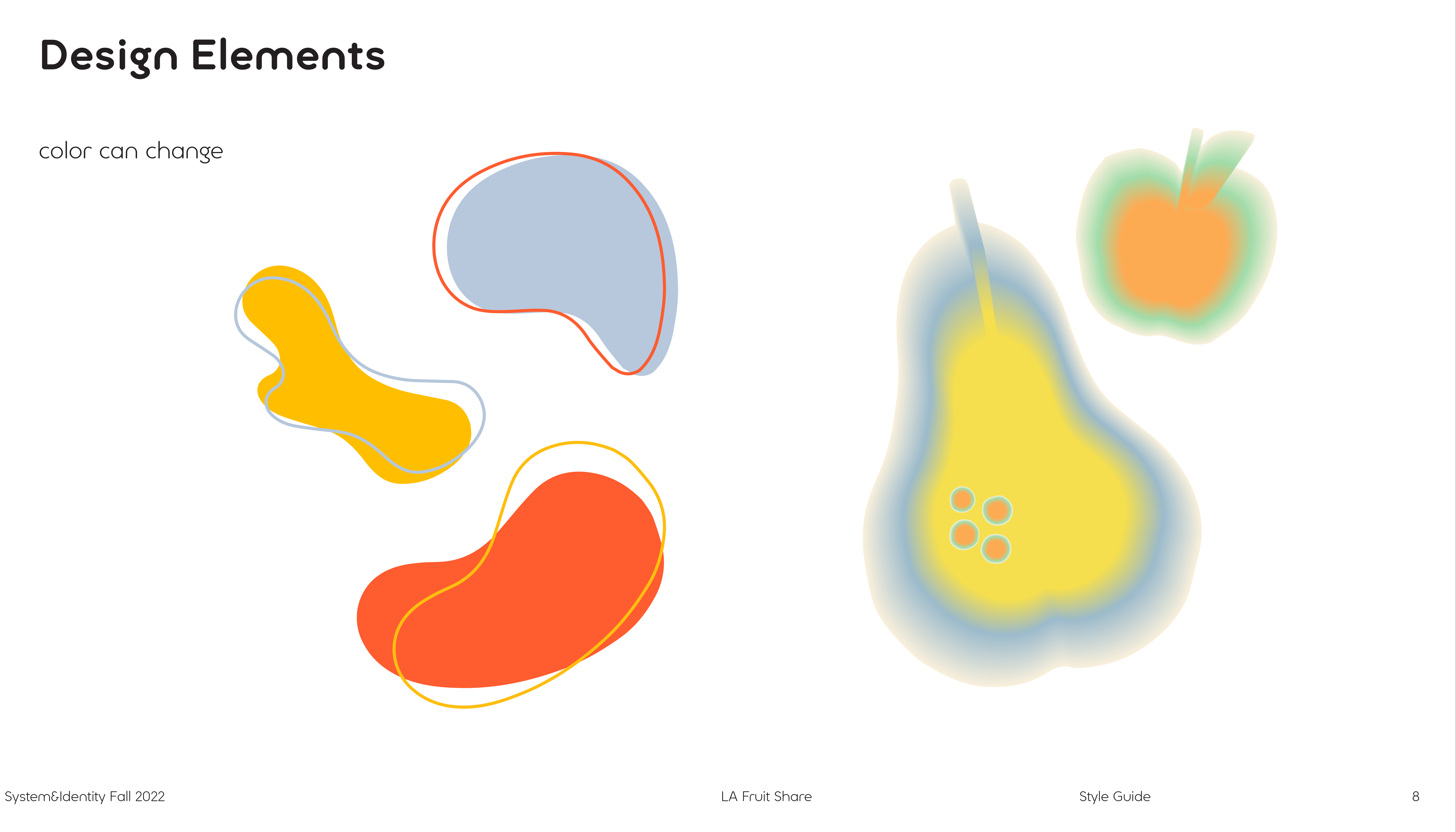
For the logo design, I think the organization has two keywords, organic (natural) and share. So in the design process, I thought about whether I could incorporate type into the organic pattern. Let the logo fit the overall design atmosphere.
I decided to add a gradient layer above the image for the image treatment. After adding the gradient layer, the gradient will give the image a soft and light tone. And make the image more vibrant.
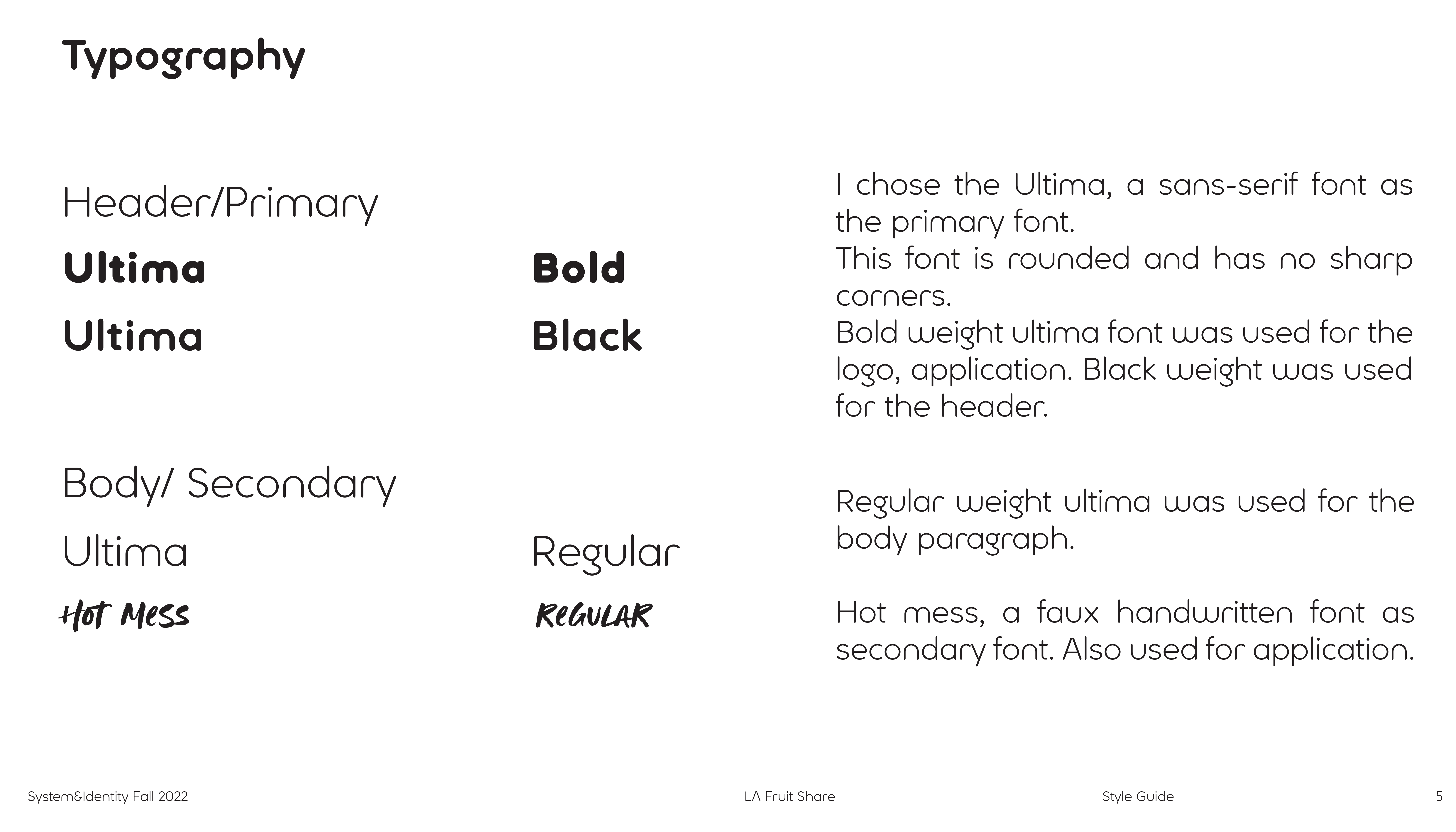
I chose the Ultima, a sans-serif font, as the primary font.
This font is rounded and has no sharp corners.
Bold weight Ultima font was used for the logo and application. Black weight was used for the header.
Regular weight Ultima was used for the body paragraph.
Hot mess, a faux handwritten font as a secondary font. Also used for application.
Postcard, Stamp
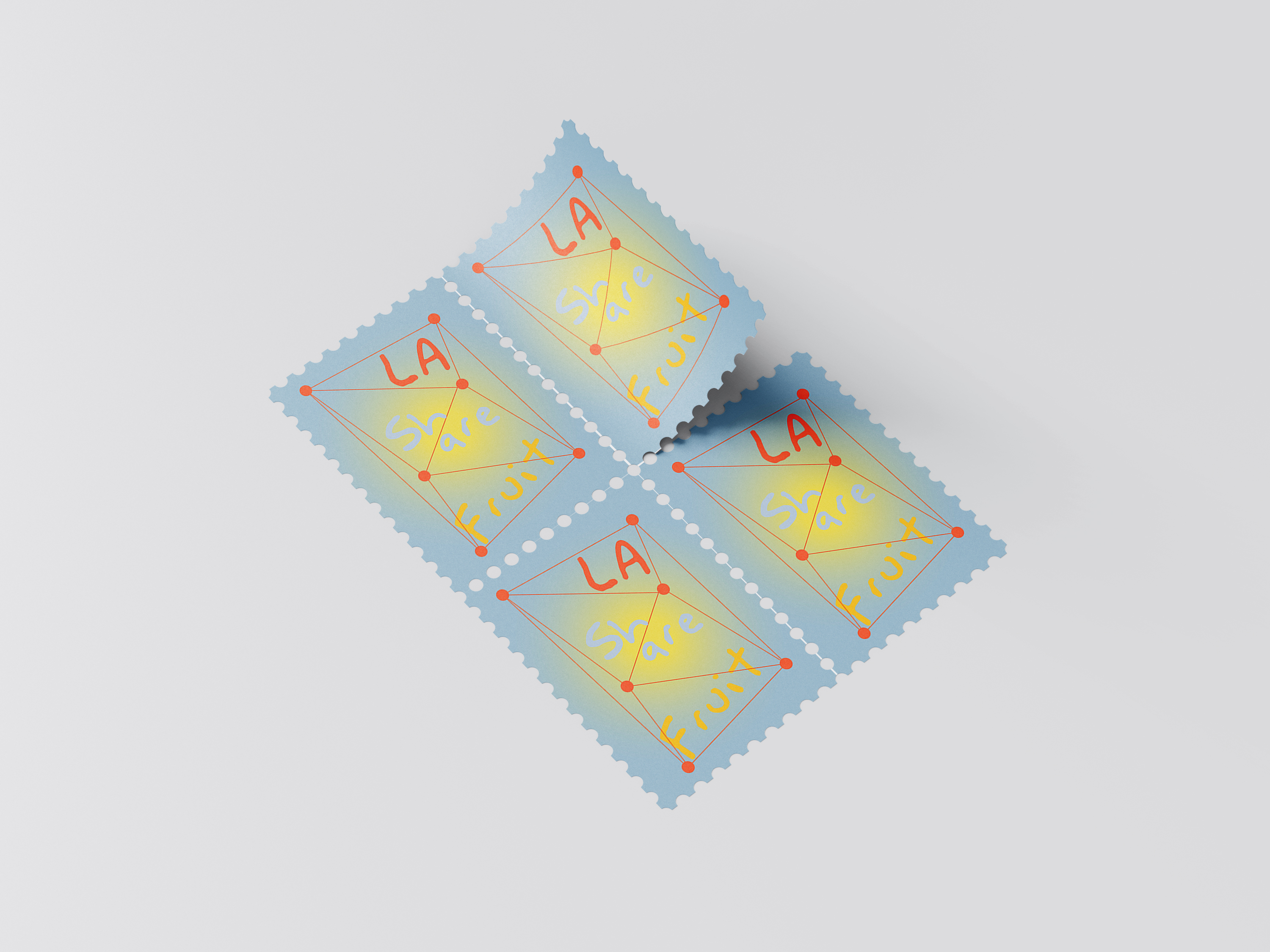
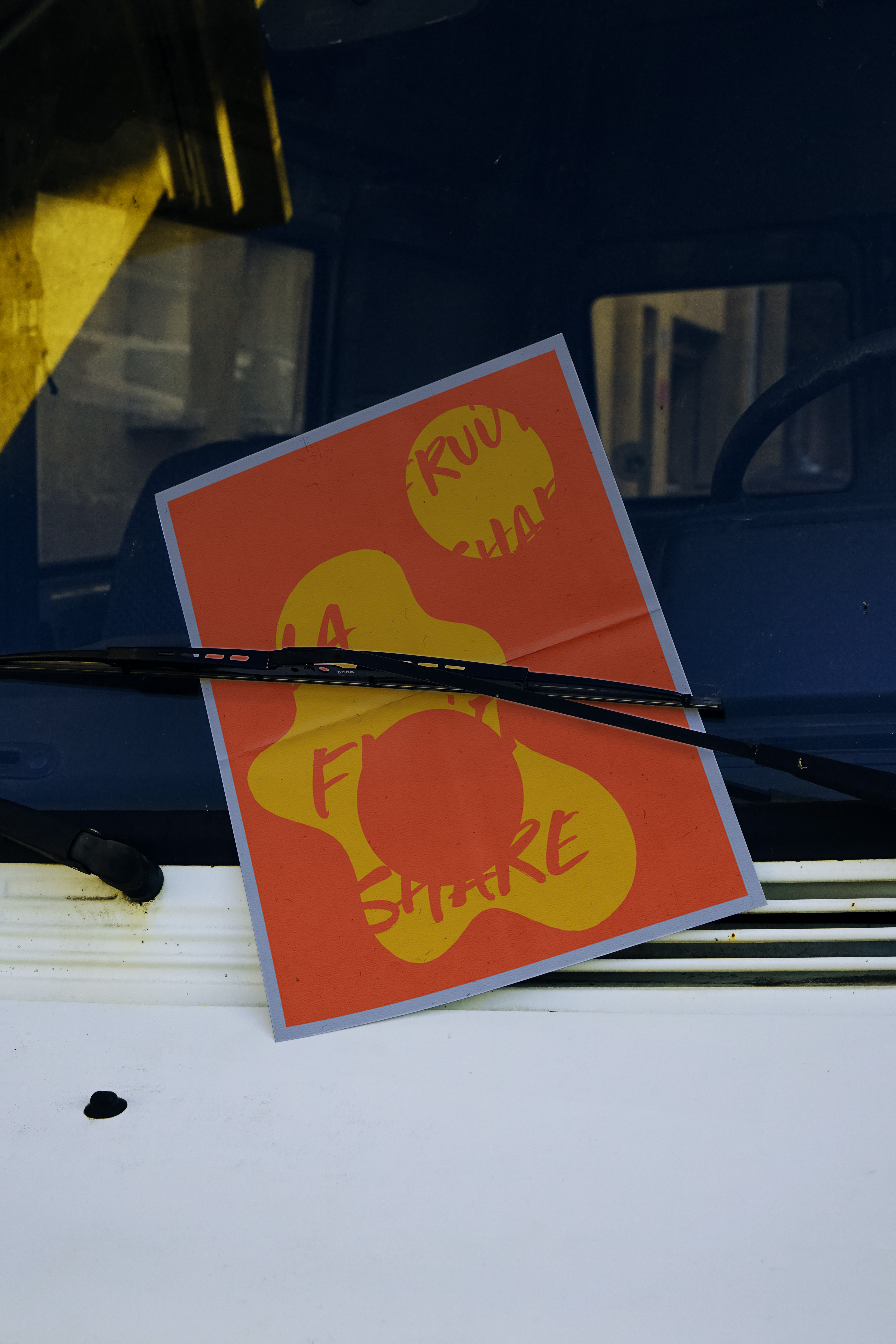
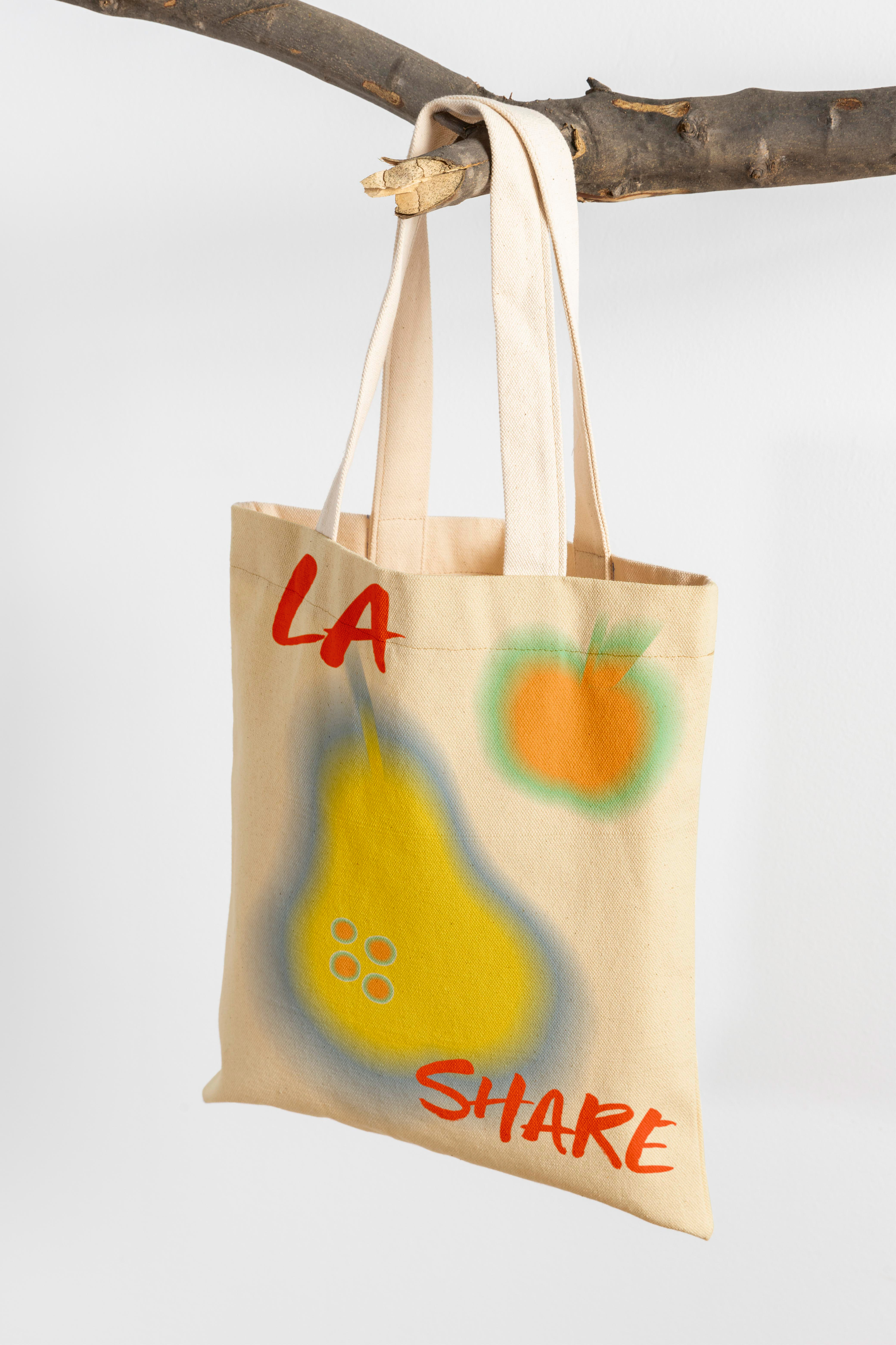
Ins Page, Poster, Totebag
Zine
![]()
![]()
![]()
![]()
![]()
![]()
![]()
About
Burn is a school project that I designed in Fall 2022.
For this project, I pick Lipstick as my topic. Since childhood, I have been very interested in my mother’s Lipstick. After I grew up, I got my own Lipstick, and I became very interested in the history and meaning of Lipstick and design.
Burn is a school project that I designed in Fall 2022.
For this project, I pick Lipstick as my topic. Since childhood, I have been very interested in my mother’s Lipstick. After I grew up, I got my own Lipstick, and I became very interested in the history and meaning of Lipstick and design.
Chapter (5)
~ Burn
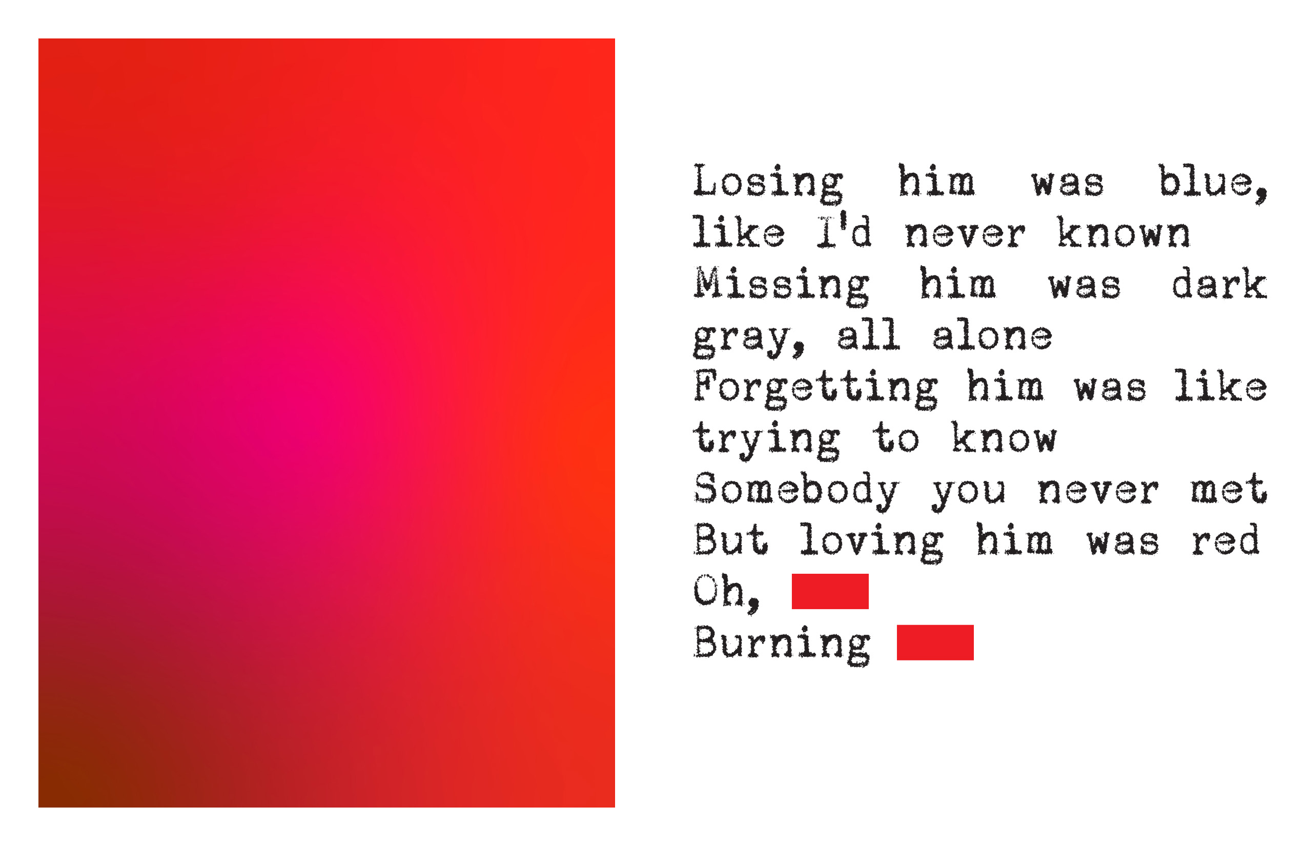
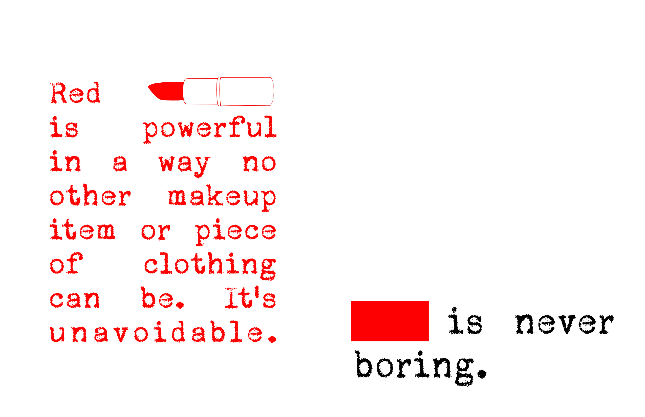
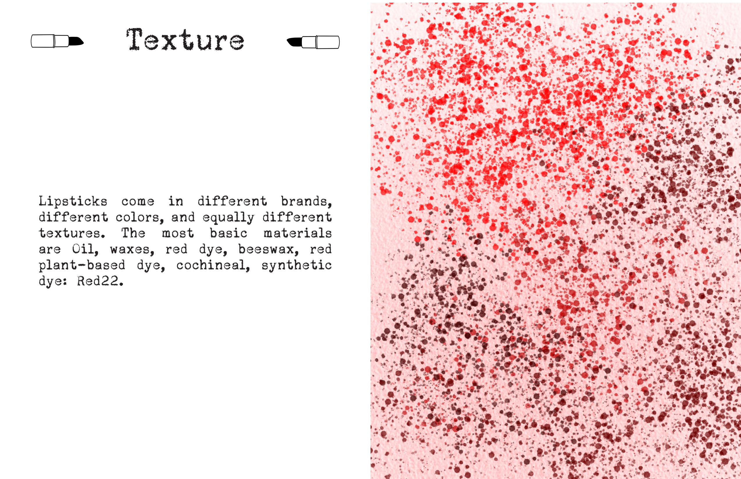
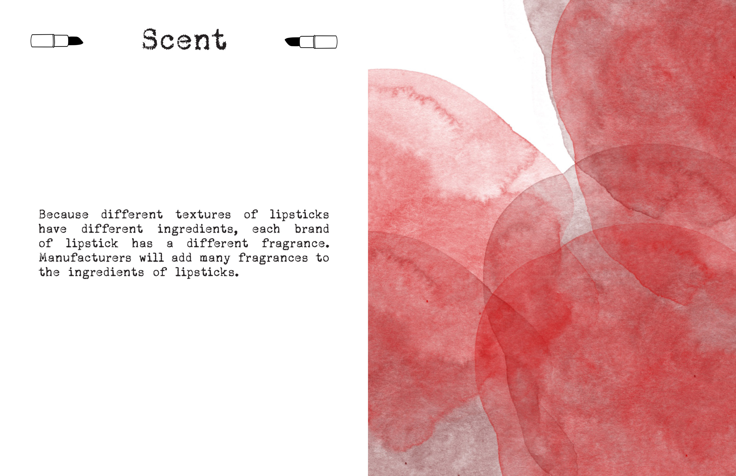
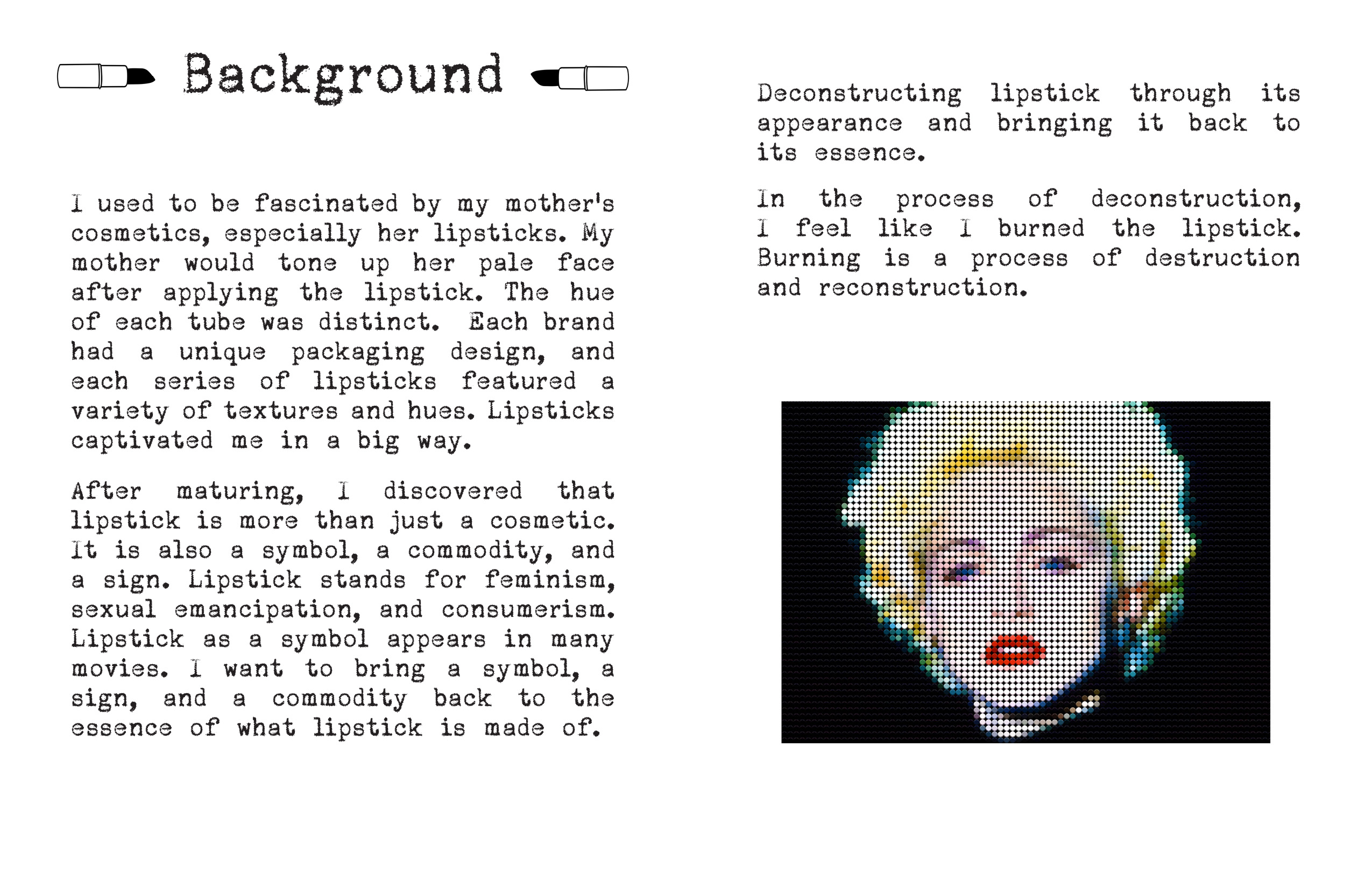
This project is about deconstruction. I designed a zine and a motion for the project. I am going to bring a symbol, a sign, and a commodity back to the essence of what lipstick is made of. Lipstick represents being sexualized and is the product of a male gaze. It also represents sexual liberation and feminism. My audience is the general public.
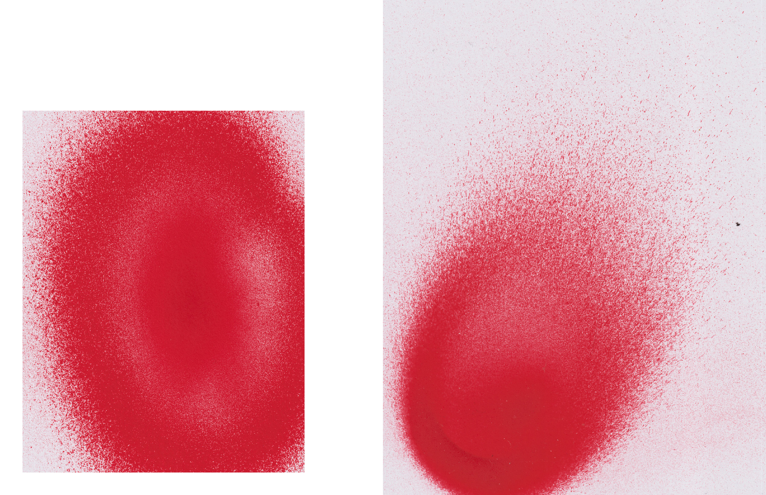
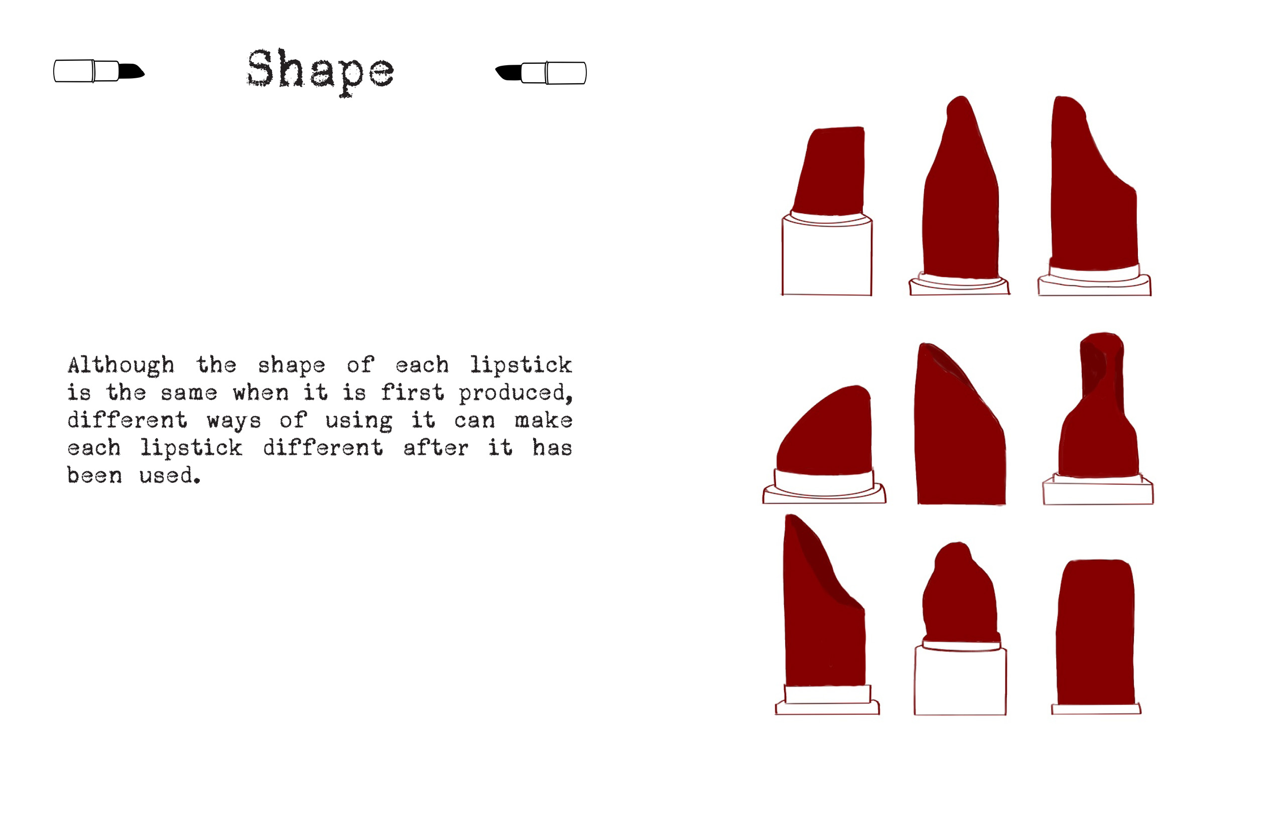
I didn't name the zine because it's a zine about the lipstick itself. I want to keep it simple. I designed it by deconstructing lipstick through color, texture, shape, and scent. Images may be abstract, this zine’s function is to giving people a basic understanding about the composition of lipstick.
For my motion piece, I named it as “BURN”. Burning is a process, a process of destruction, and then recovery from destruction. In this motion, I lit the lipstick. Ignited a commodity, a symbol. I want to bring it back to the essence. I thought about whether I could give a new meaning to lipstick, break with what it originally represented and rebuild a new language.