Design Elements&Mockup
Logo, Typeface, Color
![]()
![]()
![]()
![]()
![]() Booklet
Booklet
![]()
![]()
![]()
![]()
![]()
![]()
Logo, Typeface, Color


About
LA Fruit Share is a school project that I designed in Fall 2022.
For this project, I designed a style guide to help the nonprofit organization LA Fruit Share reestablish its identity system.
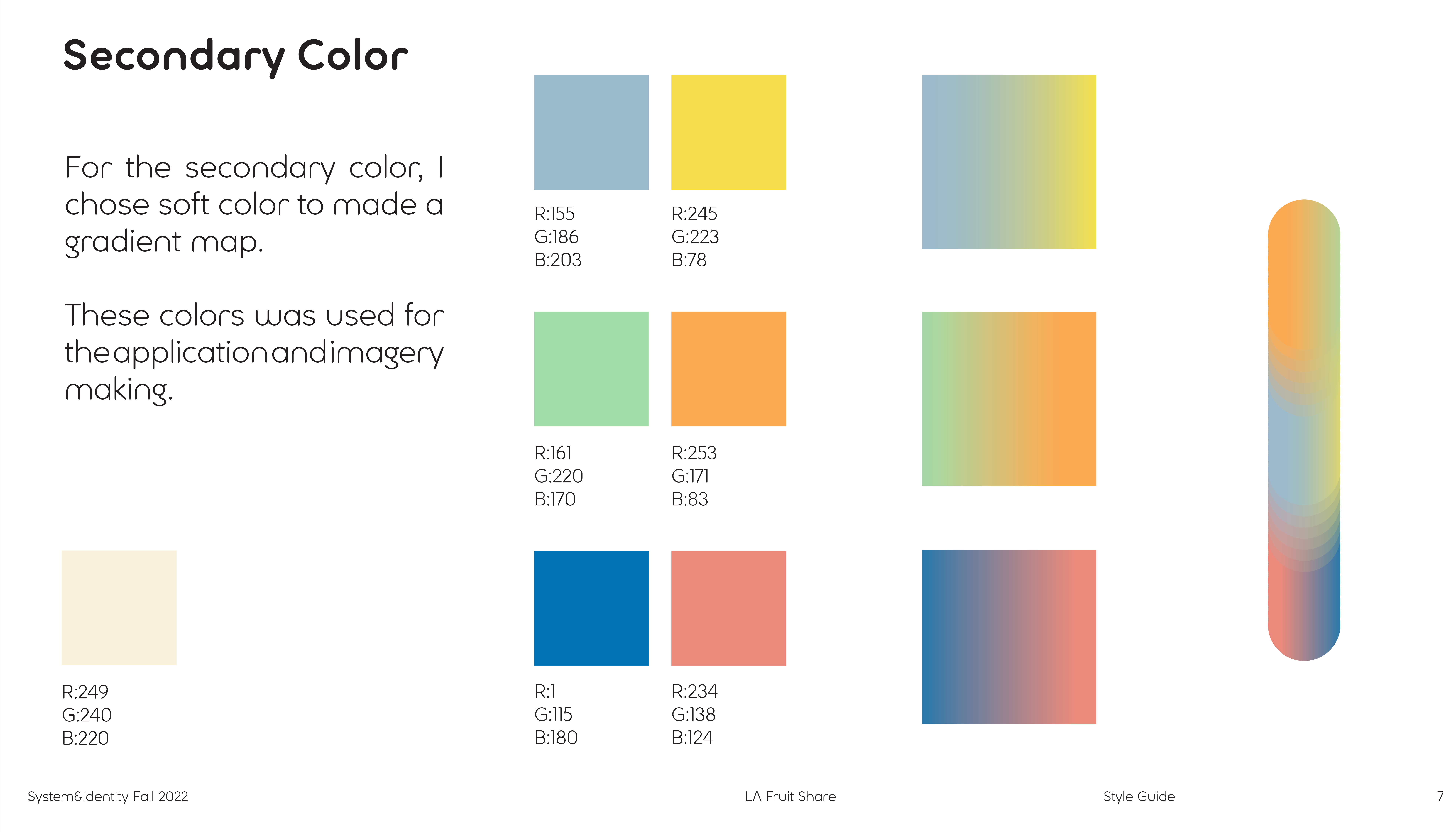
After choosing the keywords, I picked the color, font, and really thought about what feeling I wanted to deliver.
Keywords: Soft, Friendly, Energetic.
(Image Treatment)
![]()
![]()
LA Fruit Share is a school project that I designed in Fall 2022.
For this project, I designed a style guide to help the nonprofit organization LA Fruit Share reestablish its identity system.
After choosing the keywords, I picked the color, font, and really thought about what feeling I wanted to deliver.
Keywords: Soft, Friendly, Energetic.
(Image Treatment)

Chapter (4)
~ LA Fruit Share
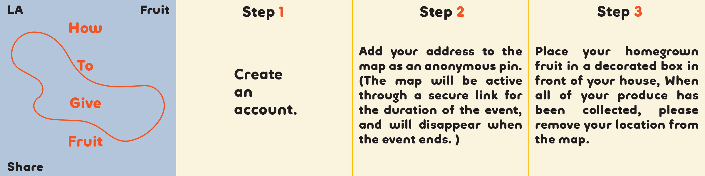
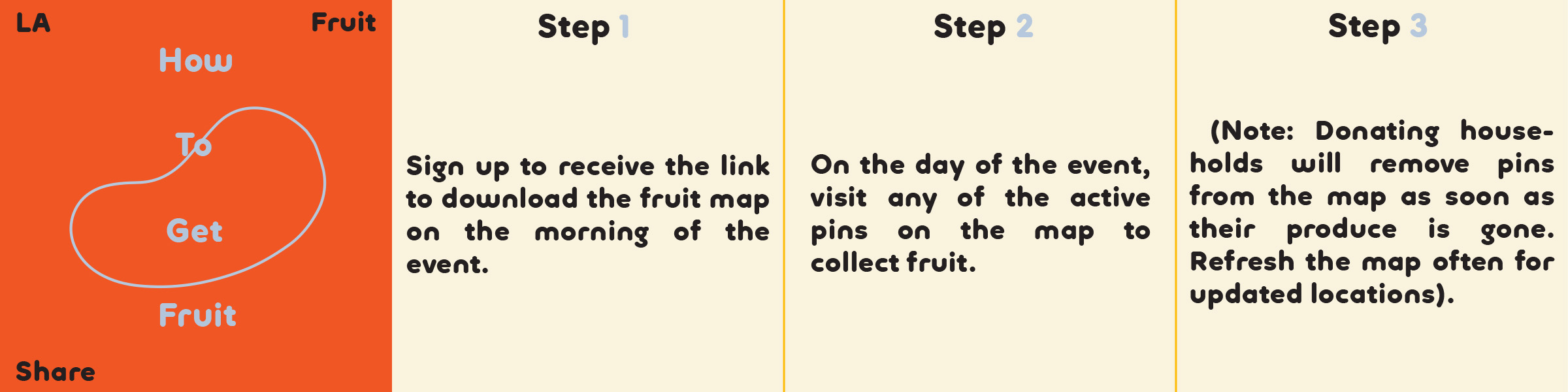
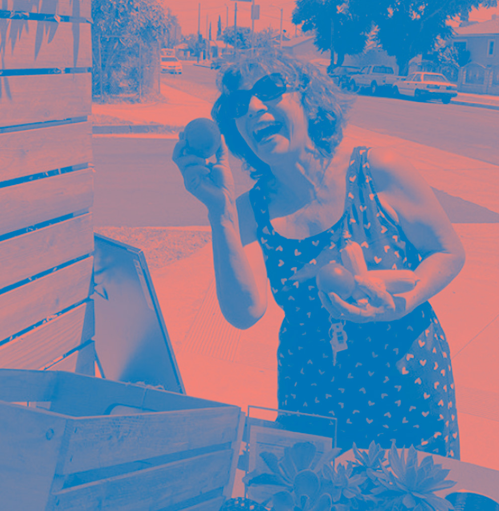
The LA Fruit Share is a seasonal call to share backyard food that all too frequently goes to waste throughout the city. Locals in Los Angeles gather their own fruits and share them with the citizens. Open to everyone, you can register and download an interactive map to collect everything.
Manifesto/Mission:
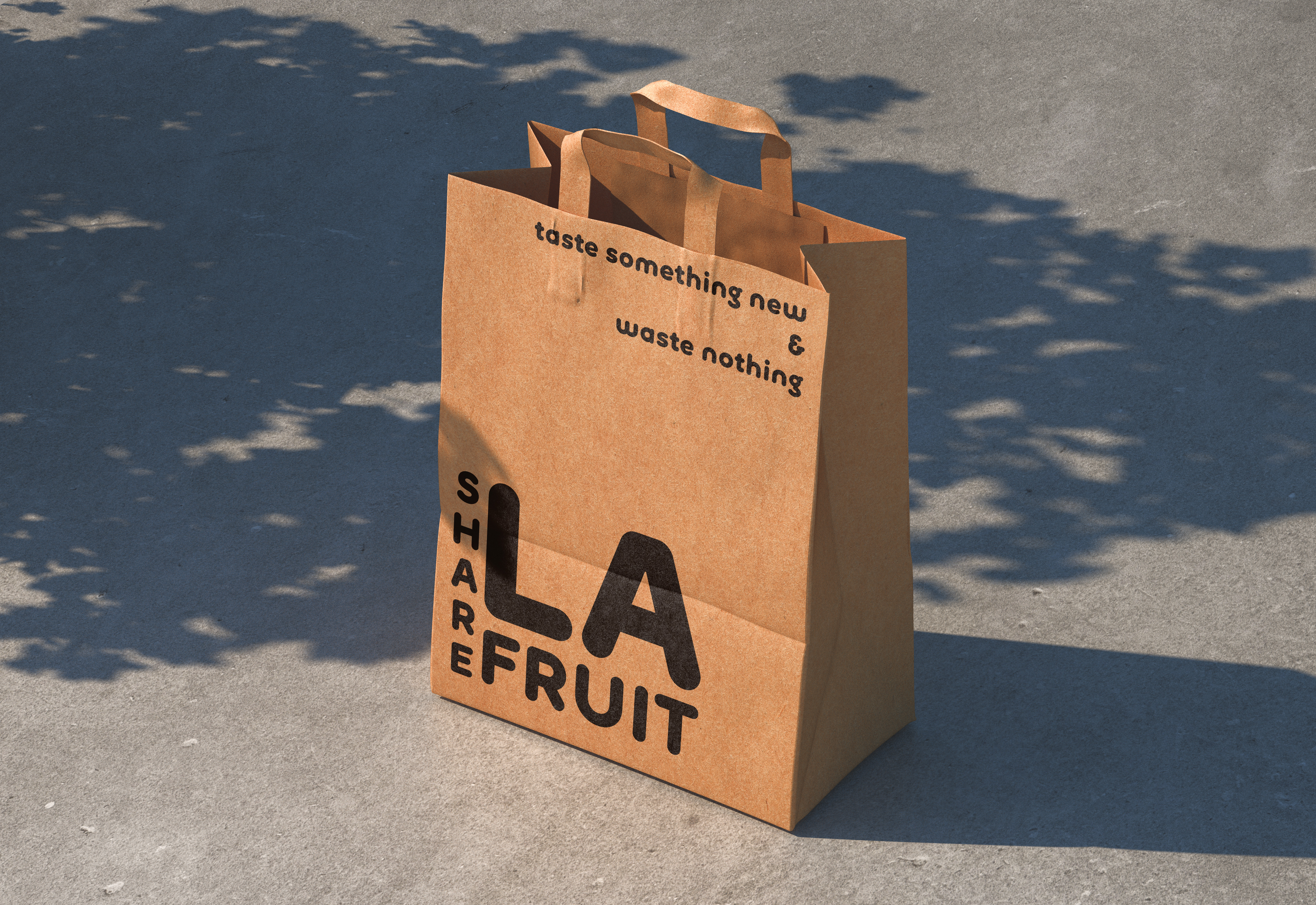
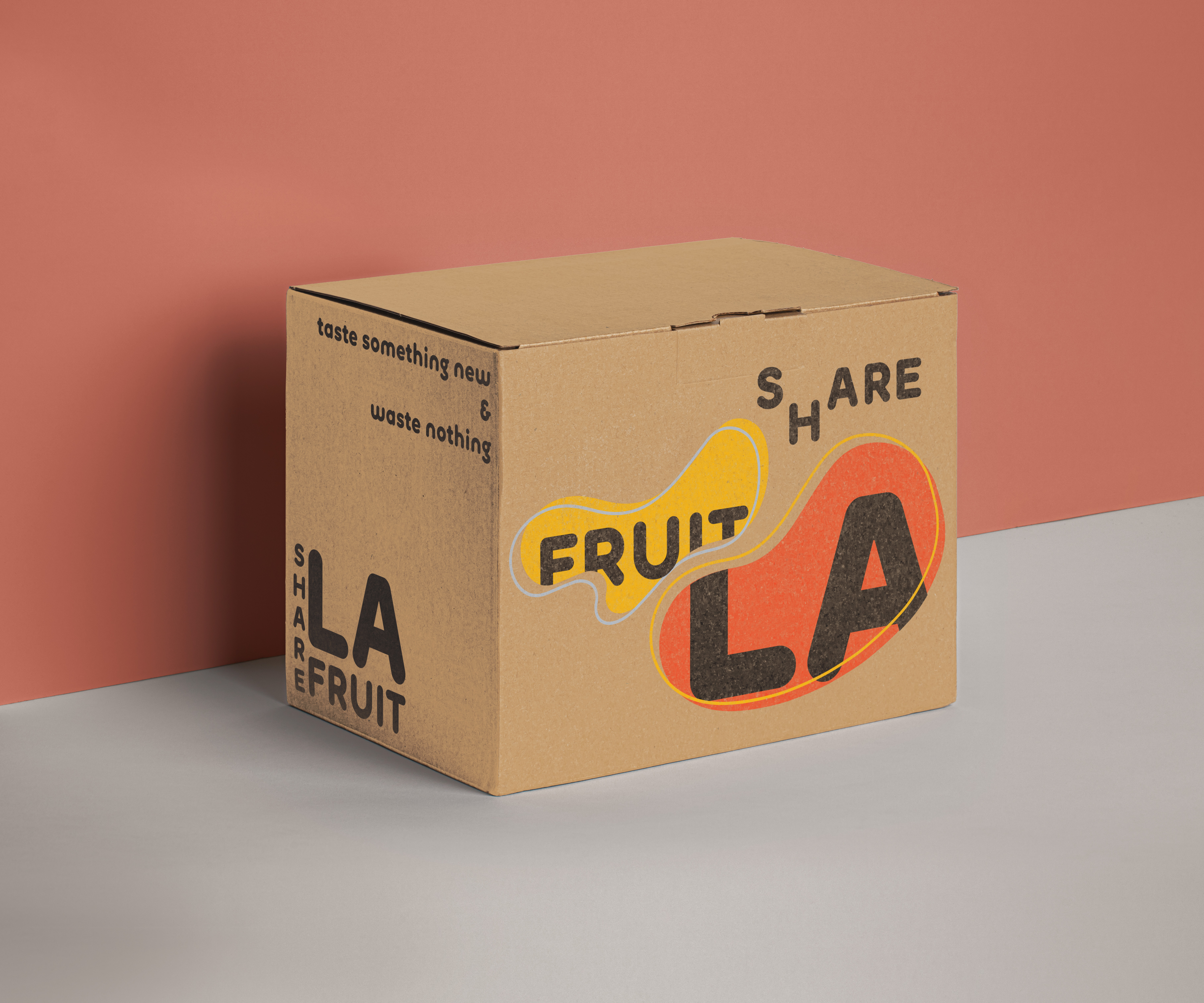
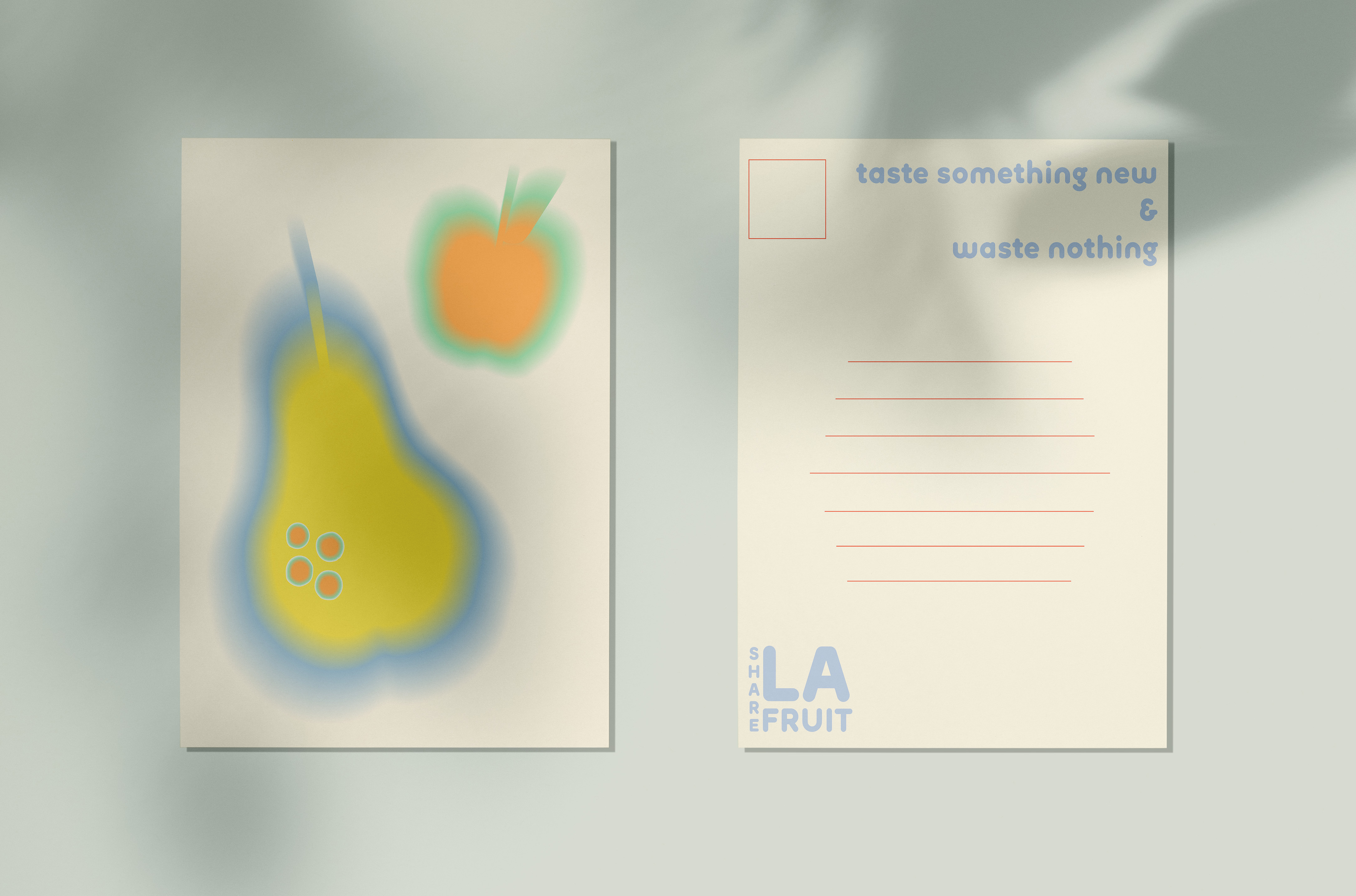
Taste something NEW & Waste nothing.
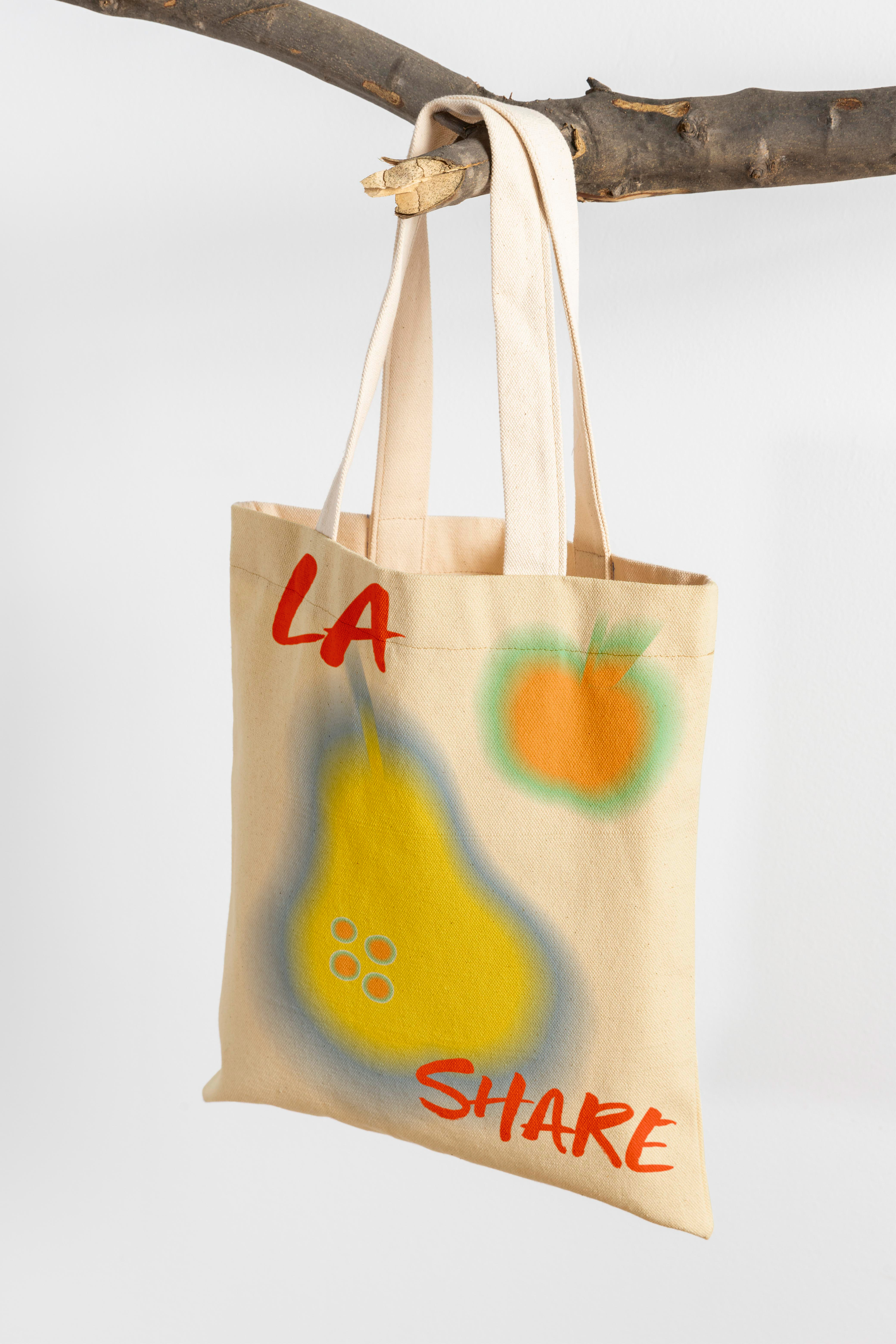
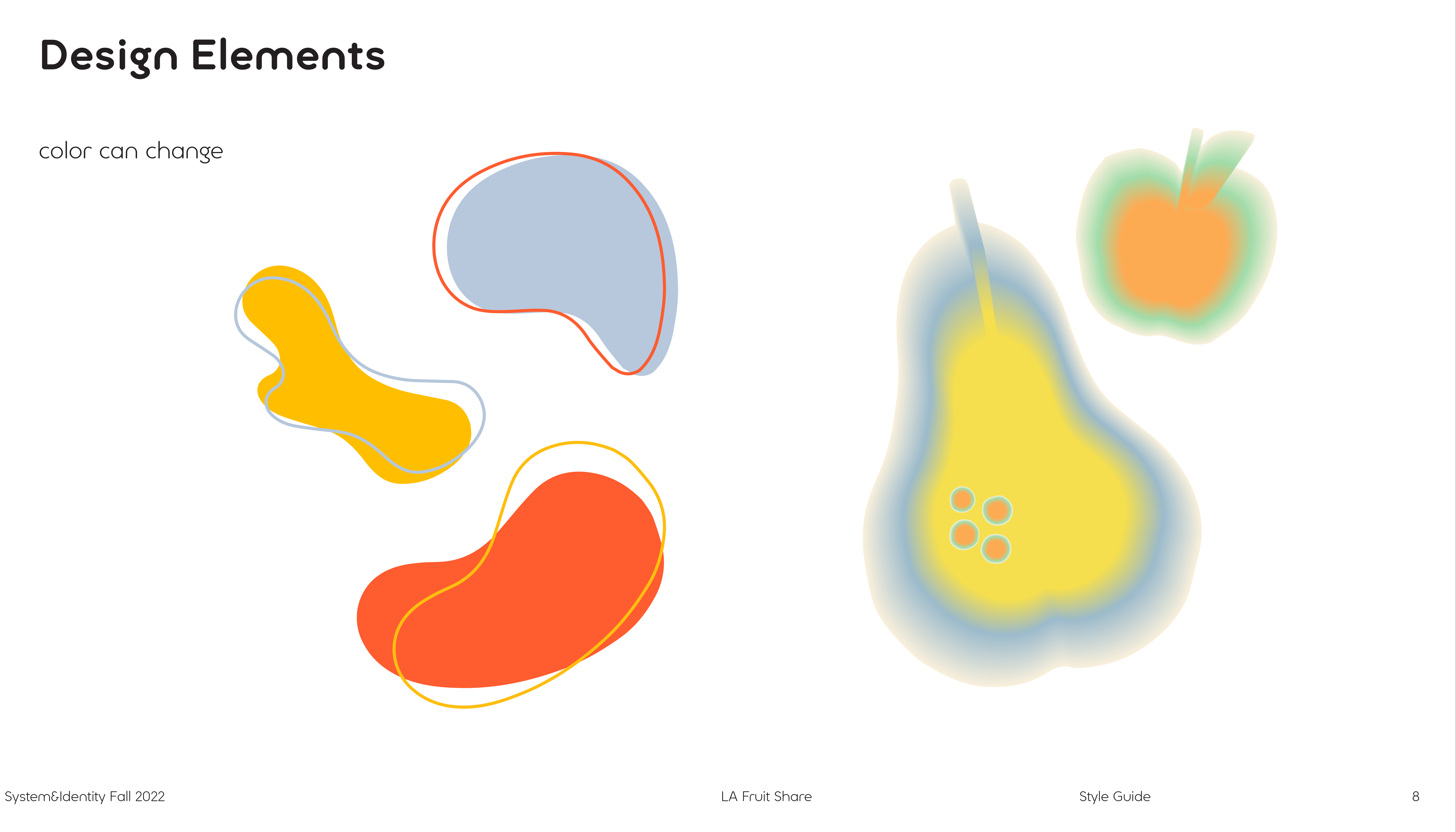
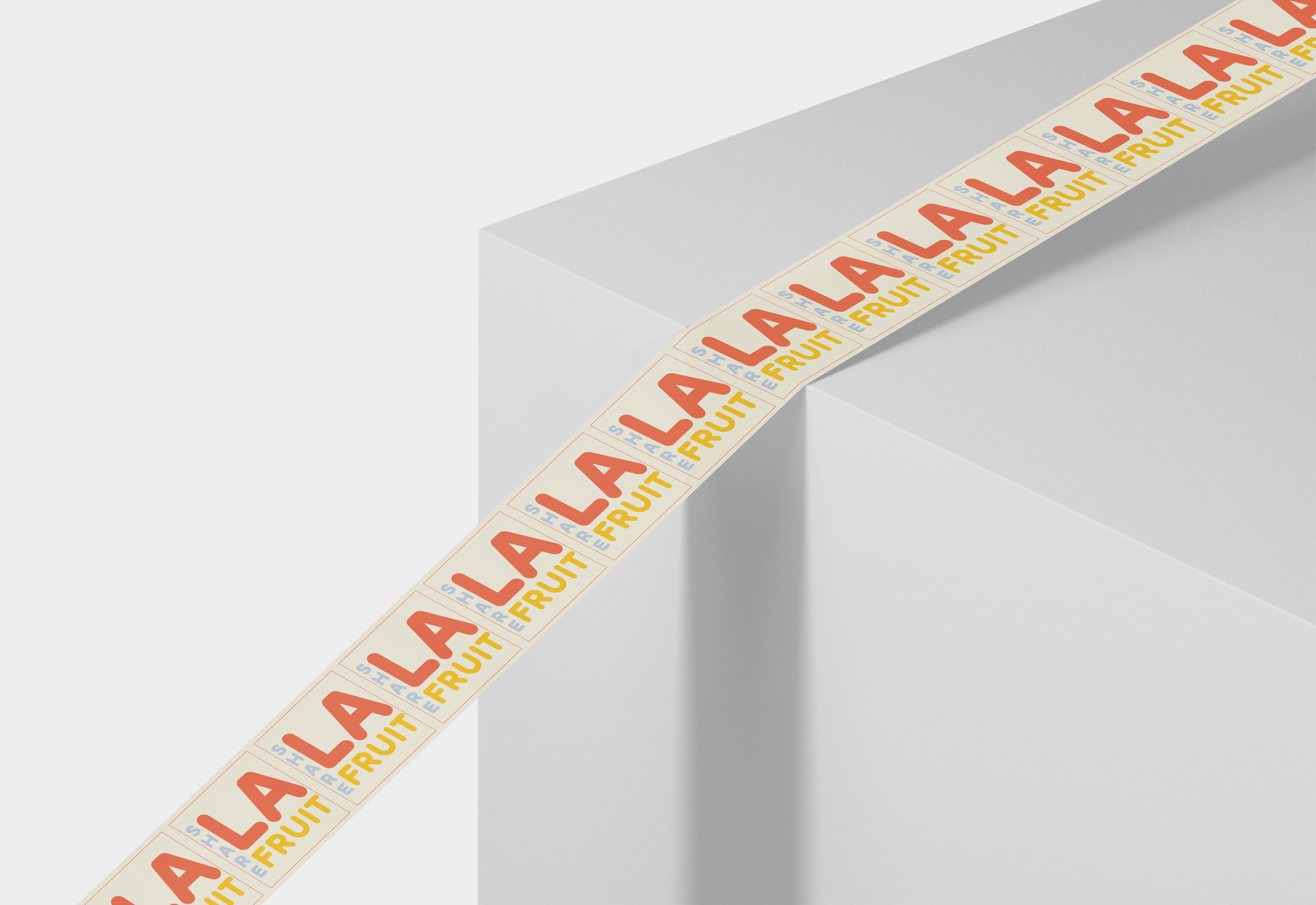
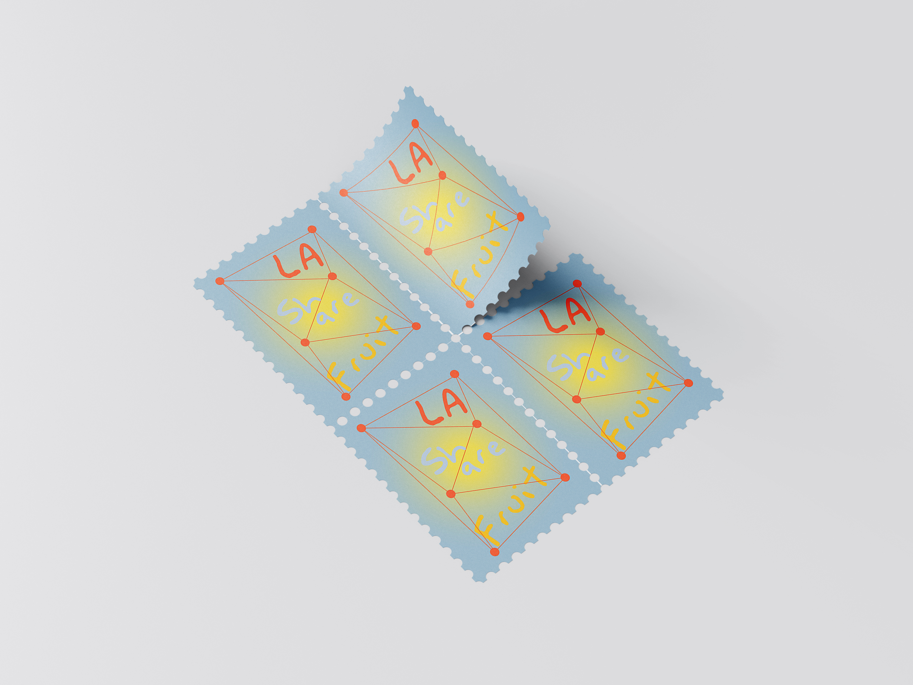
For the logo design, I think the organization has two keywords, organic (natural) and share. So in the design process, I thought about whether I could incorporate type into the organic pattern. Let the logo fit the overall design atmosphere.
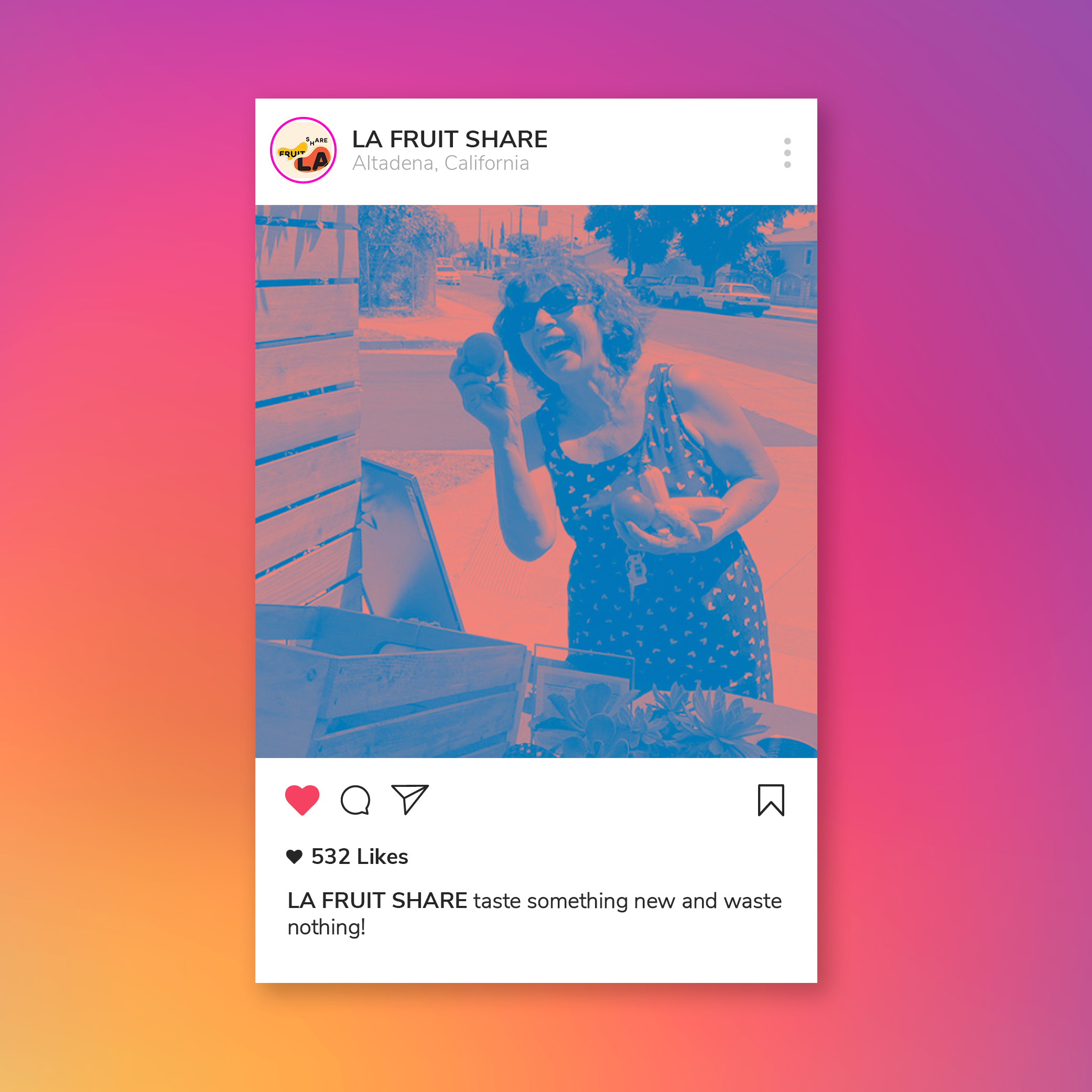
I decided to add a gradient layer above the image for the image treatment. After adding the gradient layer, the gradient will give the image a soft and light tone. And make the image more vibrant.
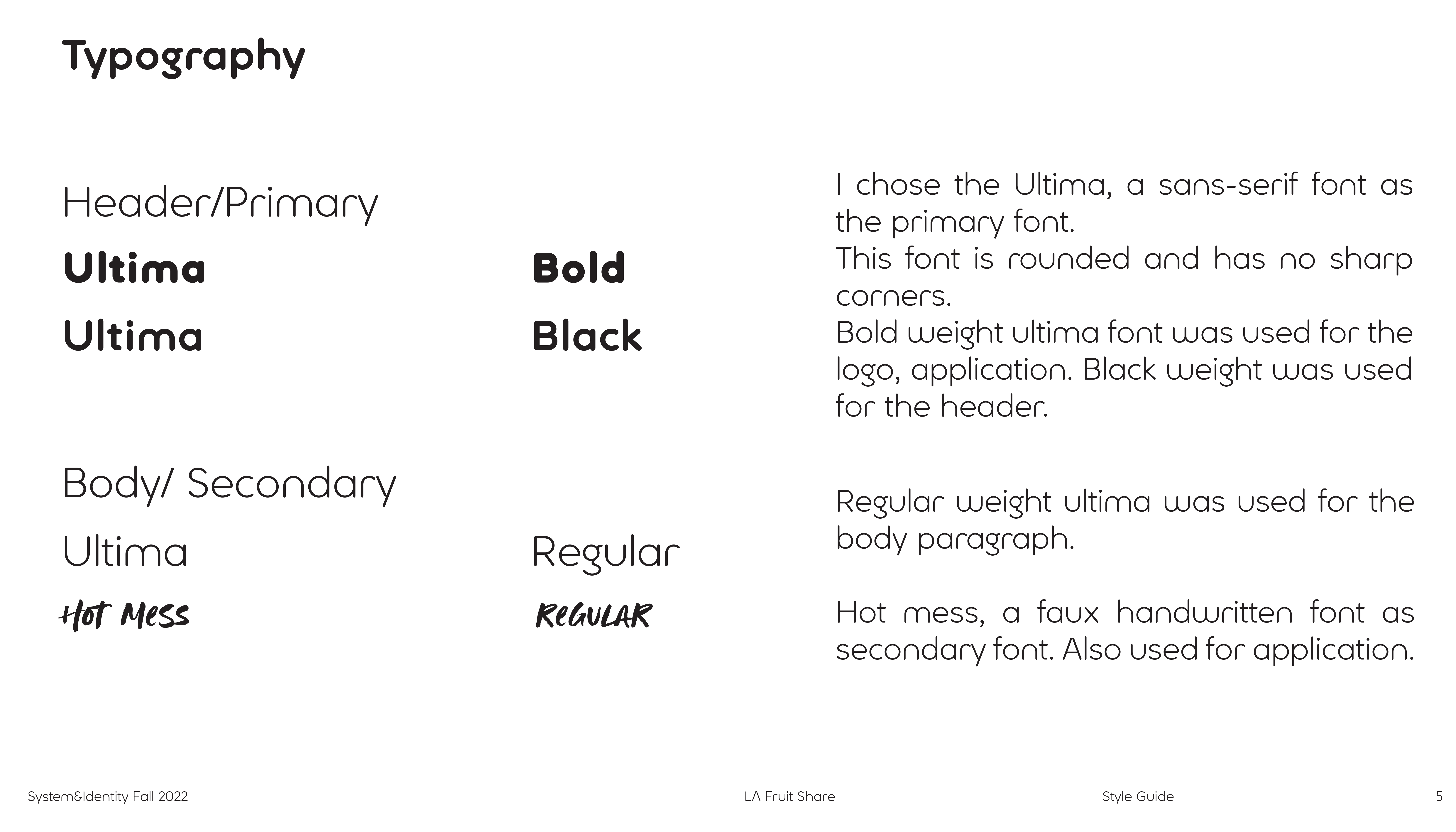
I chose the Ultima, a sans-serif font, as the primary font.
This font is rounded and has no sharp corners.
Bold weight Ultima font was used for the logo and application. Black weight was used for the header.
Regular weight Ultima was used for the body paragraph.
Hot mess, a faux handwritten font as a secondary font. Also used for application.
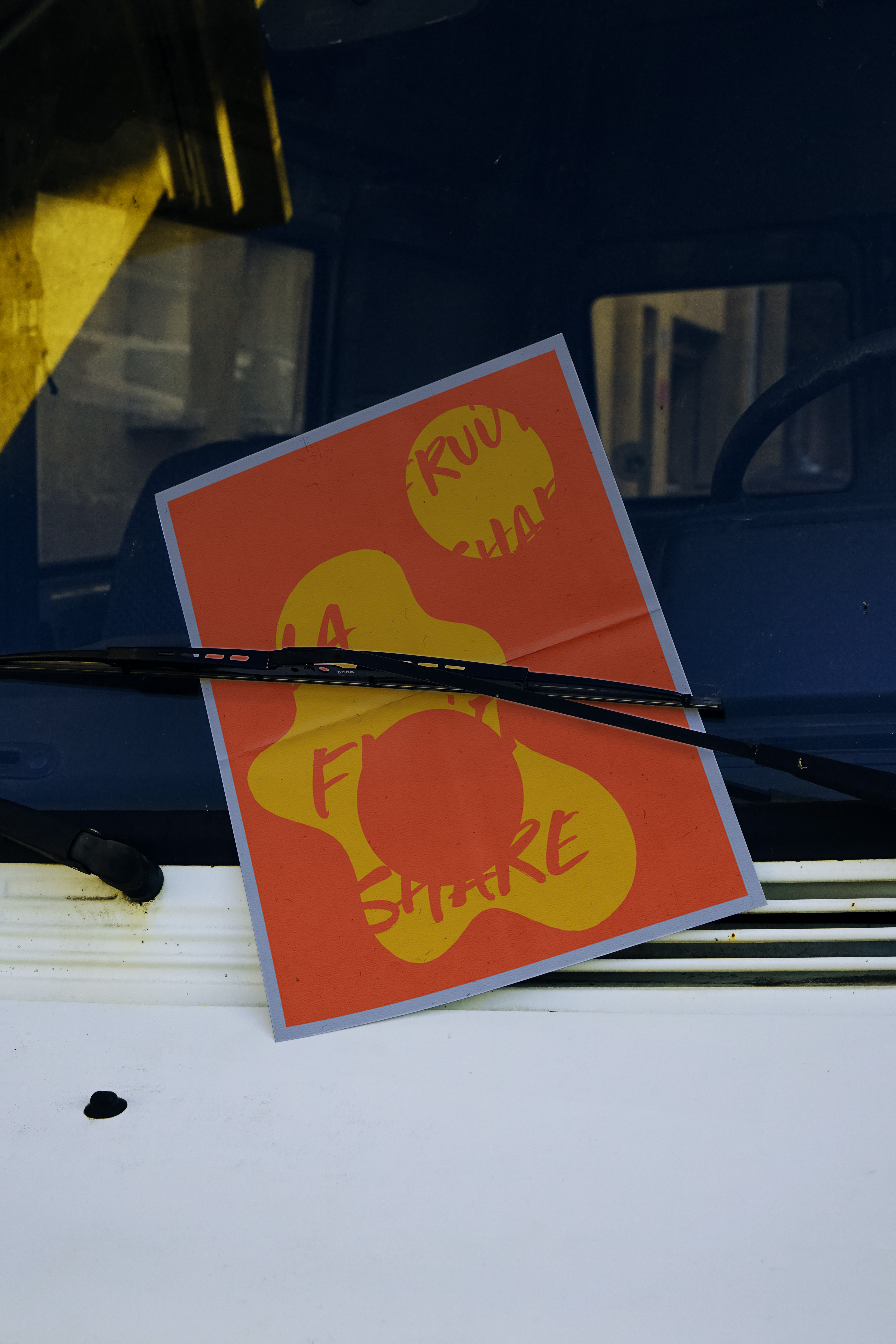
Postcard, Stamp
Ins Page, Poster, Totebag